Categorical Plot Functions
ClinicoPath Development Team
2025-10-09
Source:vignettes/legacy/08-categorical-plots-legacy.Rmd
08-categorical-plots-legacy.RmdThis vignette demonstrates the functions designed for categorical
data: jjbarstats(), jjpiestats() and
jjdotplotstats().
Bar charts with jjbarstats()
jjbarstats() creates a bar chart and automatically
performs a chi-squared test to compare the distribution of two
categorical variables. The example below compares the number of
cylinders (cyl) across transmission types
(am).
jjbarstats(data = mtcars, dep = cyl, group = am, grvar = NULL)
#>
#>  BAR CHARTS
#>
#>  <div style='padding: 15px; background-color: #f8f9fa; border-left: 4px
#>  solid #007bff; margin: 10px 0;'><h4 style='color: #007bff; margin-top:
#>  0;'>📊 About Bar Chart Analysis
#>
#>  Purpose: Compare the distribution of categorical variables across
#>  groups using statistical testing.
#>
#>  When to Use:
#>
#>  Diagnostic Tests: Compare test results (positive/negative) across
#>  patient groupsTreatment Response: Analyze response rates across
#>  different treatmentsBiomarker Expression: Compare expression levels
#>  (low/medium/high) by clinical factorsRisk Factor Analysis: Examine how
#>  risk factors relate to outcomes
#>
#>  Output Includes:
#>
#>  Visual bar chart with statistical annotationsChi-square or appropriate
#>  statistical test resultsEffect size measures and confidence
#>  intervalsPost-hoc pairwise comparisons (when >2 groups)
#>
#> character(0)
#>
#> character(0)
#>
#> character(0)
#>
#> character(0)
#>
#>  Bar chart analysis comparing cyl by am.
#>
#>  Data prepared: 32 observations (missing values will be handled by
#>  statistical functions) (cached).
#> Warning: The `size` argument of `element_line()` is deprecated as of ggplot2 3.4.0.
#> ℹ Please use the `linewidth` argument instead.
#> ℹ The deprecated feature was likely used in the jmvcore package.
#>   Please report the issue at <https://github.com/jamovi/jmvcore/issues>.
#> This warning is displayed once every 8 hours.
#> Call `lifecycle::last_lifecycle_warnings()` to see where this warning was
#> generated.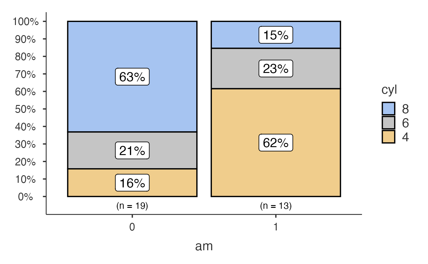
Pie charts with jjpiestats()
jjpiestats() is similar to jjbarstats() but
displays the results as a pie chart.
jjpiestats(data = mtcars, dep = cyl, group = am, grvar = NULL)
#> Warning in value[[3L]](cond): Clinical preset application failed: {error}.
#> Using custom settings. argument is missing, with no default
#> Warning in chisq.test(contingency_table): Chi-squared approximation may be
#> incorrect
#>
#>  PIE CHARTS
#>
#>  Pie Chart Analysis
#>
#>  What this analysis does: Generates pie charts with statistical
#>  analysis to compare categorical variables across groups. Performs
#>  chi-square tests, Fisher's exact tests, or other appropriate
#>  statistical tests based on your data.
#>
#>  When to use: Use when you want to visualize proportions of categorical
#>  outcomes and test for significant differences between groups. Ideal
#>  for diagnostic test results, treatment responses, or biomarker
#>  categories.
#>
#>  Current configuration: This analysis uses custom settings for pie
#>  chart generation with statistical testing.
#>
#>  What you'll get: Interactive pie charts with statistical test results,
#>  confidence intervals, and effect sizes. Optional grouped analysis for
#>  complex study designs.
#>
#>  Analysis Configuration
#>
#>  • Analyzing variable: cyl
#>
#>  • Comparing across groups: am
#>
#>  • Statistical method: Parametric
#>
#>  • Sample size: 32 observations
#>
#>  Statistical Assumptions & Warnings
#>
#>
#>
#>  General Requirements
#>
#>
#>  ✓ Data should be categorical (factors or characters)
#>  ✓ Observations should be independent
#>  ✓ For statistical tests: adequate sample size in each category
#>
#>
#>
#>  Warnings
#>
#>  ⚠️ Expected cell counts < 5 detected. Consider using Fisher's exact
#>  test (nonparametric option) for more reliable results.
#>
#>
#>
#>  How to Interpret Your Results
#>
#>  Statistical Method: Chi-square test results show whether group
#>  differences are statistically significant. Look for p-values < 0.05
#>  for significant associations.
#>
#>  Clinical Context: Interpret results in the context of your specific
#>  research question and clinical setting.
#>
#>  General Guidance: Pie charts show proportions visually - larger slices
#>  represent higher frequencies. Statistical tests determine if observed
#>  differences are likely due to chance or represent true group
#>  differences.
#>
#>  Copy-Ready Report Template
#>
#>  <div style='background-color: #f8f9fa; padding: 15px; border: 1px
#>  solid #dee2e6; border-radius: 5px;'>
#>
#>  Methods:
#>
#>  We compared {outcome} distributions across {groups} using {method}.
#>  cyl am chi-square test Statistical significance was set at p < 0.05.
#>  All analyses were performed using jamovi statistical software.
#>
#>  Results:
#>
#>  [Results will be automatically filled when analysis is complete]
#>
#>  Copy the text above and modify as needed for your manuscript or
#>  report.
#>
#>  Pie chart analysis ready Variable: cyl, grouped by am.
#>
#>  Data prepared: 32 observations (cached).
#>
#>  Statistical method: Parametric analysis.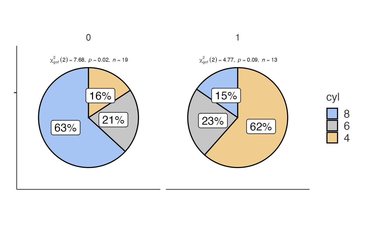
Dot charts with jjdotplotstats()
jjdotplotstats() shows group means using a dot plot. In
this example we plot horsepower (hp) by engine
configuration (vs).
jjdotplotstats(data = mtcars, dep = hp, group = vs, grvar = NULL)
#>
#>  DOT CHART
#>
#>  Processing data for dot plot analysis...
#>
#>  ℹ️ 1 potential outlier(s) detected in hp
#>
#>  📊 Analysis summary: 2 groups, 32 total observations
#>
#>  <div style='background-color: #f8f9fa; padding: 15px; border-left: 4px
#>  solid #007bff; margin: 10px 0;'><h4 style='color: #007bff; margin-top:
#>  0;'>📊 Clinical Interpretation
#>
#>  Analysis: This dot plot shows the distribution of hp across different
#>  vs categories using a t-test for comparing means.
#>
#>  Sample: Group '0' (n=18), Group '1' (n=14)
#>
#>  Results: Group '0' shows a mean of 189.72 vs Group '1' with a mean of
#>  91.36.
#>
#>  *💡 Tip: The statistical significance and effect size will be
#>  displayed in the plot subtitle when the analysis completes.*
#>
#>  <div style='background-color: #fff3cd; padding: 15px; border-left: 4px
#>  solid #ffc107; margin: 10px 0;'><h4 style='color: #856404; margin-top:
#>  0;'>🔍 Data Assessment & Recommendations
#>
#>  ℹ️ Moderate sample sizes (n < 30). Non-parametric tests may be more
#>  appropriate.
#>
#>  ✓ Approximately normal distribution suitable for parametric tests.
#>
#>  ✓ Parametric test is appropriate for your data.
#>
#>  <hr style='border-color: #ffeaa7;'>
#>
#>  Sample sizes by group:
#>  0 : n = 18
#>  1 : n = 14
#>
#>  <div style='background-color: #e7f3ff; padding: 15px; border-left: 4px
#>  solid #0066cc; margin: 10px 0;'><h4 style='color: #0066cc; margin-top:
#>  0;'>📝 Copy-Ready Report Sentence
#>
#>  <div style='background-color: white; padding: 10px; border: 1px dashed
#>  #0066cc; font-family: "Times New Roman", serif;'>
#>
#>  A independent samples t-test was performed to compare *hp* between
#>  *vs* groups. The dot plot visualization shows the distribution and
#>  central tendencies across groups, with statistical results displayed
#>  in the plot subtitle including effect size and significance testing.
#>
#>  *💡 Click to select the text above and copy to your report.
#>  Statistical values will be automatically filled when the analysis
#>  completes.*
#>
#> character(0)
#>
#> character(0)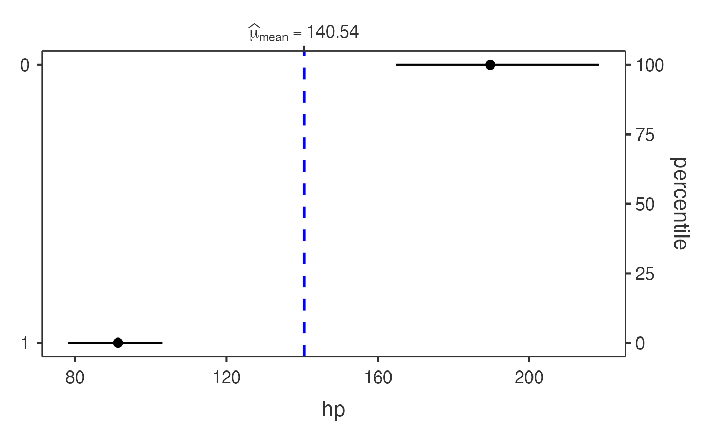
Each function returns a results object whose plot
element contains the ggplot2 visualisation.