'Create advanced ridgeline plots. Visualize distributions across groups with multiple style options, annotations, statistical overlays, and publication-ready formatting. Supports both basic and complex ridge plots with inside plots, double ridgelines, and color gradients.'
Usage
jjridges(
  data,
  x_var,
  y_var,
  fill_var = NULL,
  facet_var = NULL,
  plot_type = "density_ridges",
  scale = 1,
  bandwidth = "nrd0",
  bandwidth_value = 1,
  binwidth = 1,
  add_boxplot = FALSE,
  add_points = FALSE,
  point_alpha = 0.3,
  add_quantiles = FALSE,
  quantiles = "0.25, 0.5, 0.75",
  add_mean = FALSE,
  add_median = FALSE,
  show_stats = FALSE,
  test_type = "parametric",
  p_adjust_method = "none",
  effsize_type = "d",
  alpha = 0.8,
  color_palette = "clinical_colorblind",
  custom_colors = "#3498db,#e74c3c,#2ecc71,#f39c12",
  gradient_low = "#0000FF",
  gradient_high = "#FF0000",
  fill_ridges = TRUE,
  reverse_order = FALSE,
  show_fill_legend = TRUE,
  show_facet_legend = TRUE,
  theme_style = "theme_ridges",
  grid_lines = FALSE,
  expand_panels = TRUE,
  legend_position = "none",
  plot_title = "",
  plot_subtitle = "",
  plot_caption = "",
  x_label = "",
  y_label = "",
  add_sample_size = FALSE,
  add_density_values = FALSE,
  custom_annotations = "",
  width = 800,
  height = 600,
  dpi = 300
)
Arguments
- data
The data as a data frame.
- x_var
The continuous variable to display as distributions (e.g., biomarker values, age, tumor size). Each group will show the distribution pattern of this variable.
- y_var
The grouping variable for comparison (e.g., disease stage, treatment group, pathology grade). Each group creates a separate ridge for visual comparison.
- fill_var
Optional variable for color/fill mapping within ridges. Creates color-coded segments within each ridge.
- facet_var
Optional variable for creating separate panels. Useful for comparing ridge plots across another dimension.
- plot_type
Type of ridge plot. 'density_ridges' for smooth curves, 'density_ridges_gradient' adds color gradients, 'histogram_ridges' for discrete bins, 'violin_ridges' for violin-style plots, 'double_ridges' for comparing two distributions.
- scale
Controls ridge height and overlap. Values > 1 create overlapping ridges, < 1 creates more separation between ridges.
- bandwidth
Bandwidth selection for density estimation. Controls smoothness of curves.
- bandwidth_value
Custom bandwidth value when bandwidth method is 'custom'.
- binwidth
Width of bins for histogram-style ridges.
- add_boxplot
Add boxplot elements inside each ridge for enhanced visualization of quartiles and outliers.
- add_points
Show individual data points below ridges as jittered points.
- point_alpha
Transparency of data points when shown.
- add_quantiles
Add vertical lines at specified quantiles within each ridge.
- quantiles
Comma-separated quantile values to display as vertical lines.
- add_mean
Add vertical line at the mean of each distribution.
- add_median
Add vertical line at the median of each distribution.
- show_stats
Display statistical annotations including p-values and effect sizes using ggstatsplot functionality.
- test_type
Type of statistical test for group comparisons when show_stats is TRUE.
- p_adjust_method
Method for adjusting p-values in multiple comparisons.
- effsize_type
Type of effect size to calculate and display. For skewed data (like lymph node counts), consider using nonparametric effect sizes: Cliff's Delta shows probability that one group has higher values, Hodges-Lehmann shift shows typical difference in units.
- alpha
Transparency level for ridge fills.
- color_palette
Color palette for ridges. 'Clinical' is optimized for accessibility and medical publications. Viridis family are also colorblind-friendly.
- custom_colors
Comma-separated list of custom colors when palette is 'custom'.
- gradient_low
Low value color for gradient plots.
- gradient_high
High value color for gradient plots.
- fill_ridges
Whether to fill ridges with color or show only outlines.
- reverse_order
Reverse the vertical order of groups.
- show_fill_legend
Show legend for fill variable when a fill variable is specified.
- show_facet_legend
Show facet labels when faceting is used.
- theme_style
Overall plot theme style.
- grid_lines
Whether to show grid lines in the plot.
- expand_panels
Remove space around plot area for cleaner look.
- legend_position
Position of color legend.
- plot_title
Main plot title.
- plot_subtitle
Plot subtitle for additional context.
- plot_caption
Caption for data source or notes.
- x_label
Custom label for X axis.
- y_label
Custom label for Y axis.
- add_sample_size
Display sample size (n) for each group.
- add_density_values
Display density values at peaks.
- custom_annotations
Custom text annotations in format 'x,y,text;x2,y2,text2'.
- width
Width of the plot in pixels.
- height
Height of the plot in pixels.
- dpi
Resolution for plot export.
Value
A results object containing:
results$instructions | a html | ||||
results$warnings | a html | ||||
results$clinicalSummary | a html | ||||
results$plot | an image | ||||
results$statistics | a table | ||||
results$tests | a table | ||||
results$interpretation | a html |
Tables can be converted to data frames with asDF or as.data.frame. For example:
results$statistics$asDF
as.data.frame(results$statistics)
Examples
# \donttest{
# Basic ridgeline plot
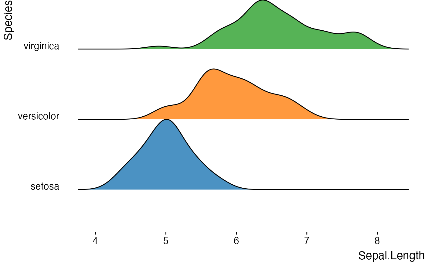
jjridges(
data = iris,
x_var = "Sepal.Length",
y_var = "Species"
)
#> Warning: Ignoring unknown parameters: `size`
#>
#> ADVANCED RIDGE PLOT
#>
#> <div class='clinical-summary' style='background:#f8f9fa;
#> border-left:4px solid #007bff; padding:15px; margin:10px 0;'><h4
#> style='color:#007bff; margin-top:0;'>Clinical Summary
#>
#> Analysis: Ridge plot comparing the distribution of Sepal.Length across
#> 3 groups defined by Species.
#>
#> Sample: n = 150 total observations across all groups.
#>
#> Interpretation Guide:
#>
#> <ul style='margin-bottom:10px;'>Ridge Shape: Wider ridges = more
#> variability; Narrow ridges = consistent valuesRidge Position:
#> Left/right shift indicates lower/higher average valuesMultiple Peaks:
#> May indicate subgroups or distinct clinical phenotypesOverlap: Similar
#> distributions between groups; Separation = distinct patterns
#>
#> Statistical Summary
#> ───────────────────────────────────────────────────────────────────────────────────────────────────────────────
#> Group N Mean SD Median Q1 Q3 Min Max
#> ───────────────────────────────────────────────────────────────────────────────────────────────────────────────
#> setosa 50 5.0060000 0.3524897 5.0000000 4.8000000 5.2000000 4.3000000 5.8000000
#> versicolor 50 5.9360000 0.5161711 5.9000000 5.6000000 6.3000000 4.9000000 7.0000000
#> virginica 50 6.5880000 0.6358796 6.5000000 6.2250000 6.9000000 4.9000000 7.9000000
#> ───────────────────────────────────────────────────────────────────────────────────────────────────────────────
#>
#>
#> <div class='clinical-summary' style='background:#f8f9fa;
#> border-left:4px solid #007bff; padding:15px; margin:10px 0;'><h4
#> style='color:#007bff; margin-top:0;'>Clinical Summary
#>
#> Analysis: Ridge plot comparing the distribution of Sepal.Length across
#> 3 groups defined by Species.
#>
#> Sample: n = 150 total observations across all groups.
#>
#> Interpretation Guide:
#>
#> <ul style='margin-bottom:10px;'>Ridge Shape: Wider ridges = more
#> variability; Narrow ridges = consistent valuesRidge Position:
#> Left/right shift indicates lower/higher average valuesMultiple Peaks:
#> May indicate subgroups or distinct clinical phenotypesOverlap: Similar
#> distributions between groups; Separation = distinct patterns
#>
#> Technical Interpretation
#>
#> The ridge plot displays the distribution of Sepal.Length across 3
#> groups defined by Species.
#>
#> Each ridge: Shows the probability density or frequency distribution
#> for a groupOverlapping areas: Indicate similar value ranges between
#> groupsRidge height and spread: Indicate the concentration and
#> variability of valuesPeaks: Show the most common values (modes) within
#> each group
 # Advanced with statistics
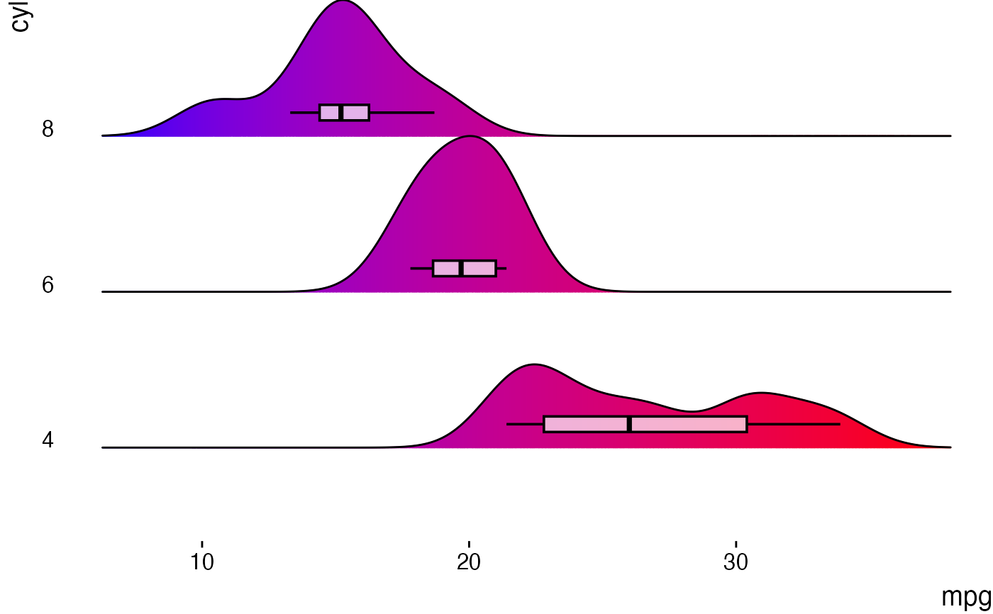
jjridges(
data = mtcars,
x_var = "mpg",
y_var = "cyl",
plot_type = "density_ridges_gradient",
show_stats = TRUE,
add_boxplot = TRUE
)
#>
#> ADVANCED RIDGE PLOT
#>
#> <div class='clinical-summary' style='background:#f8f9fa;
#> border-left:4px solid #007bff; padding:15px; margin:10px 0;'><h4
#> style='color:#007bff; margin-top:0;'>Clinical Summary
#>
#> Analysis: Ridge plot comparing the distribution of mpg across 3 groups
#> defined by cyl.
#>
#> Sample: n = 32 total observations across all groups.
#>
#> Interpretation Guide:
#>
#> <ul style='margin-bottom:10px;'>Ridge Shape: Wider ridges = more
#> variability; Narrow ridges = consistent valuesRidge Position:
#> Left/right shift indicates lower/higher average valuesMultiple Peaks:
#> May indicate subgroups or distinct clinical phenotypesOverlap: Similar
#> distributions between groups; Separation = distinct patterns
#>
#> Statistical Summary
#> ────────────────────────────────────────────────────────────────────────────────────────────────────────────────
#> Group N Mean SD Median Q1 Q3 Min Max
#> ────────────────────────────────────────────────────────────────────────────────────────────────────────────────
#> 4 11 26.6636364 4.5098277 26.0000000 22.8000000 30.4000000 21.4000000 33.9000000
#> 6 7 19.7428571 1.4535670 19.7000000 18.6500000 21.0000000 17.8000000 21.4000000
#> 8 14 15.1000000 2.5600481 15.2000000 14.4000000 16.2500000 10.4000000 19.2000000
#> ────────────────────────────────────────────────────────────────────────────────────────────────────────────────
#>
#>
#> Statistical Tests
#> ──────────────────────────────────────────────────────────────────────────────────────────────────
#> Comparison Statistic P-value P-adj Effect Size CI Lower CI Upper
#> ──────────────────────────────────────────────────────────────────────────────────────────────────
#> 6 vs 4 -4.7190594 0.0004048 0.0004048 -1.8833246 -10.0901820 -3.7513765
#> 6 vs 8 5.2911346 0.0000454 0.0000454 2.0456036 2.8029253 6.4827890
#> 4 vs 8 7.5966641 0.0000016 0.0000016 3.2645335 8.3185176 14.8087551
#> ──────────────────────────────────────────────────────────────────────────────────────────────────
#>
#>
#> <div class='clinical-summary' style='background:#f8f9fa;
#> border-left:4px solid #007bff; padding:15px; margin:10px 0;'><h4
#> style='color:#007bff; margin-top:0;'>Clinical Summary
#>
#> Analysis: Ridge plot comparing the distribution of mpg across 3 groups
#> defined by cyl.
#>
#> Sample: n = 32 total observations across all groups.
#>
#> Interpretation Guide:
#>
#> <ul style='margin-bottom:10px;'>Ridge Shape: Wider ridges = more
#> variability; Narrow ridges = consistent valuesRidge Position:
#> Left/right shift indicates lower/higher average valuesMultiple Peaks:
#> May indicate subgroups or distinct clinical phenotypesOverlap: Similar
#> distributions between groups; Separation = distinct patterns
#>
#> Technical Interpretation
#>
#> The ridge plot displays the distribution of mpg across 3 groups
#> defined by cyl.
#>
#> Each ridge: Shows the probability density or frequency distribution
#> for a groupOverlapping areas: Indicate similar value ranges between
#> groupsRidge height and spread: Indicate the concentration and
#> variability of valuesPeaks: Show the most common values (modes) within
#> each group<div style='background:#e3f2fd; padding:10px; margin:10px 0;
#> border-radius:4px;'>🎨 Gradient Coloring: Colors represent the value
#> of mpg along each ridge, helping visualize how values are distributed
#> within groups.<div style='background:#e8f5e8; padding:10px;
#> margin:10px 0; border-radius:4px;'>📊 Boxplots: Show median (center
#> line), quartiles (box boundaries), and outliers for each group.
#> Compare medians and quartile ranges across groups for clinical
#> significance.<div style='background:#fff3e0; padding:10px; margin:10px
#> 0; border-radius:4px;'>📈 Statistical Tests: Pairwise comparisons test
#> whether group differences are statistically significant. Consider
#> effect sizes alongside p-values for clinical importance. Adjust for
#> multiple comparisons when appropriate.
# Advanced with statistics
jjridges(
data = mtcars,
x_var = "mpg",
y_var = "cyl",
plot_type = "density_ridges_gradient",
show_stats = TRUE,
add_boxplot = TRUE
)
#>
#> ADVANCED RIDGE PLOT
#>
#> <div class='clinical-summary' style='background:#f8f9fa;
#> border-left:4px solid #007bff; padding:15px; margin:10px 0;'><h4
#> style='color:#007bff; margin-top:0;'>Clinical Summary
#>
#> Analysis: Ridge plot comparing the distribution of mpg across 3 groups
#> defined by cyl.
#>
#> Sample: n = 32 total observations across all groups.
#>
#> Interpretation Guide:
#>
#> <ul style='margin-bottom:10px;'>Ridge Shape: Wider ridges = more
#> variability; Narrow ridges = consistent valuesRidge Position:
#> Left/right shift indicates lower/higher average valuesMultiple Peaks:
#> May indicate subgroups or distinct clinical phenotypesOverlap: Similar
#> distributions between groups; Separation = distinct patterns
#>
#> Statistical Summary
#> ────────────────────────────────────────────────────────────────────────────────────────────────────────────────
#> Group N Mean SD Median Q1 Q3 Min Max
#> ────────────────────────────────────────────────────────────────────────────────────────────────────────────────
#> 4 11 26.6636364 4.5098277 26.0000000 22.8000000 30.4000000 21.4000000 33.9000000
#> 6 7 19.7428571 1.4535670 19.7000000 18.6500000 21.0000000 17.8000000 21.4000000
#> 8 14 15.1000000 2.5600481 15.2000000 14.4000000 16.2500000 10.4000000 19.2000000
#> ────────────────────────────────────────────────────────────────────────────────────────────────────────────────
#>
#>
#> Statistical Tests
#> ──────────────────────────────────────────────────────────────────────────────────────────────────
#> Comparison Statistic P-value P-adj Effect Size CI Lower CI Upper
#> ──────────────────────────────────────────────────────────────────────────────────────────────────
#> 6 vs 4 -4.7190594 0.0004048 0.0004048 -1.8833246 -10.0901820 -3.7513765
#> 6 vs 8 5.2911346 0.0000454 0.0000454 2.0456036 2.8029253 6.4827890
#> 4 vs 8 7.5966641 0.0000016 0.0000016 3.2645335 8.3185176 14.8087551
#> ──────────────────────────────────────────────────────────────────────────────────────────────────
#>
#>
#> <div class='clinical-summary' style='background:#f8f9fa;
#> border-left:4px solid #007bff; padding:15px; margin:10px 0;'><h4
#> style='color:#007bff; margin-top:0;'>Clinical Summary
#>
#> Analysis: Ridge plot comparing the distribution of mpg across 3 groups
#> defined by cyl.
#>
#> Sample: n = 32 total observations across all groups.
#>
#> Interpretation Guide:
#>
#> <ul style='margin-bottom:10px;'>Ridge Shape: Wider ridges = more
#> variability; Narrow ridges = consistent valuesRidge Position:
#> Left/right shift indicates lower/higher average valuesMultiple Peaks:
#> May indicate subgroups or distinct clinical phenotypesOverlap: Similar
#> distributions between groups; Separation = distinct patterns
#>
#> Technical Interpretation
#>
#> The ridge plot displays the distribution of mpg across 3 groups
#> defined by cyl.
#>
#> Each ridge: Shows the probability density or frequency distribution
#> for a groupOverlapping areas: Indicate similar value ranges between
#> groupsRidge height and spread: Indicate the concentration and
#> variability of valuesPeaks: Show the most common values (modes) within
#> each group<div style='background:#e3f2fd; padding:10px; margin:10px 0;
#> border-radius:4px;'>🎨 Gradient Coloring: Colors represent the value
#> of mpg along each ridge, helping visualize how values are distributed
#> within groups.<div style='background:#e8f5e8; padding:10px;
#> margin:10px 0; border-radius:4px;'>📊 Boxplots: Show median (center
#> line), quartiles (box boundaries), and outliers for each group.
#> Compare medians and quartile ranges across groups for clinical
#> significance.<div style='background:#fff3e0; padding:10px; margin:10px
#> 0; border-radius:4px;'>📈 Statistical Tests: Pairwise comparisons test
#> whether group differences are statistically significant. Consider
#> effect sizes alongside p-values for clinical importance. Adjust for
#> multiple comparisons when appropriate.
 # }
# }