Visualization Gallery for Clinical Research
ClinicoPath Development Team
2025-06-30
Source:vignettes/general-10-visualization-gallery.Rmd
general-10-visualization-gallery.RmdIntroduction
Effective data visualization is crucial for communicating clinical research findings. This vignette showcases the comprehensive visualization capabilities of ClinicoPathDescriptives, demonstrating how to create publication-ready figures for various types of clinical data analysis.
Visualization Philosophy
Design Principles
- Clarity: Clear, unambiguous representation of data
- Accuracy: Truthful representation without distortion
- Efficiency: Maximum information with minimum ink
- Aesthetics: Professional appearance suitable for publication
- Context: Appropriate for clinical research audience
library(ClinicoPath)
library(dplyr)
library(ggplot2)
library(knitr)

# Load datasets
data(histopathology)
data(treatmentResponse)

# Prepare enhanced dataset for visualization examples
viz_data <- histopathology %>%
  mutate(
    Age_Group = case_when(
      Age < 40 ~ "< 40 years",
      Age >= 40 & Age < 60 ~ "40-59 years",
      Age >= 60 ~ "≥ 60 years"
    ),
    Outcome_Status = case_when(
      Outcome == 1 ~ "Event Occurred",
      Outcome == 0 ~ "Event-Free",
      TRUE ~ "Unknown"
    ),
    Risk_Profile = case_when(
      Grade == "3" & LymphNodeMetastasis == "Present" ~ "High Risk",
      Grade == "3" | LymphNodeMetastasis == "Present" ~ "Intermediate Risk",
      TRUE ~ "Low Risk"
    ),
    Treatment_Response = case_when(
      Group == "Treatment" & Outcome == 0 ~ "Treatment Success",
      Group == "Treatment" & Outcome == 1 ~ "Treatment Failure",
      Group == "Control" & Outcome == 0 ~ "Control Success",
      TRUE ~ "Control Failure"
    )
  )

cat("Enhanced dataset prepared with", nrow(viz_data), "patients and", ncol(viz_data), "variables\n")
#> Enhanced dataset prepared with 250 patients and 42 variables
Section 1: Demographic Visualizations
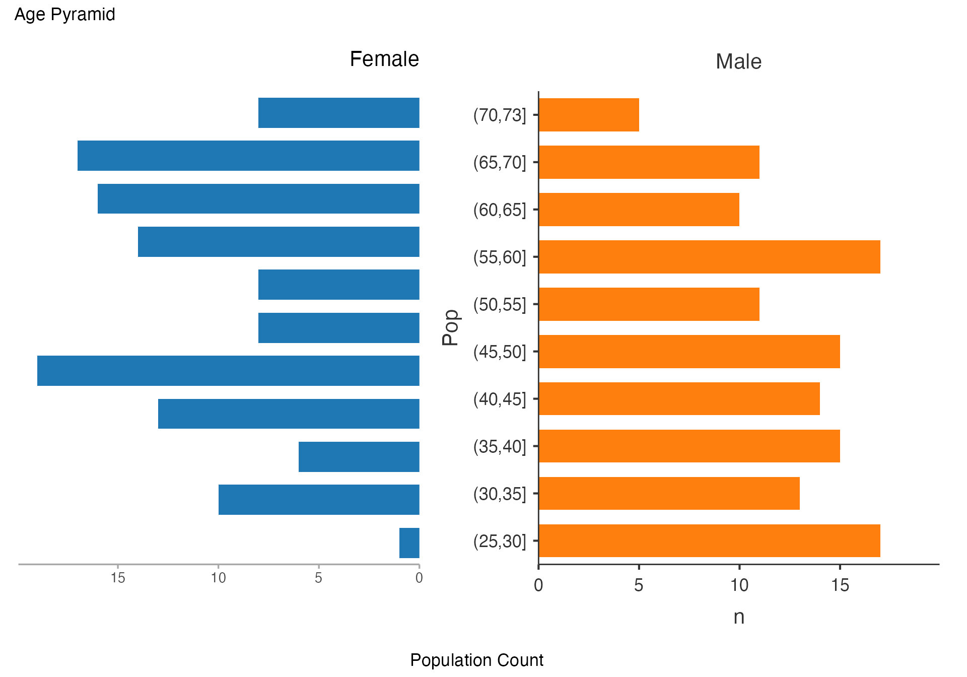
Age Pyramid - Population Structure
# Classic age pyramid showing population structure
agepyramid(
  data = viz_data,
  age = "Age",
  gender = "Sex",
  female = "Female"
)
#>
#>  AGE PYRAMID
#>
#>  Population Data
#>  ────────────────────────────────
#>    Population    Female    Male
#>  ────────────────────────────────
#>    (70,73]            8       5
#>    (65,70]           17      11
#>    (60,65]           16      10
#>    (55,60]           14      17
#>    (50,55]            8      11
#>    (45,50]            8      15
#>    (40,45]           19      14
#>    (35,40]           13      15
#>    (30,35]            6      13
#>    (25,30]           10      17
#>    (20,25]            1       0
#>  ────────────────────────────────
Age Pyramid by Treatment Group
# Age pyramid comparing treatment groups
agepyramid(
  data = viz_data,
  age = "Age",
  gender = "Sex",
  female = "Female"
)
#>
#>  AGE PYRAMID
#>
#>  Population Data
#>  ────────────────────────────────
#>    Population    Female    Male
#>  ────────────────────────────────
#>    (70,73]            8       5
#>    (65,70]           17      11
#>    (60,65]           16      10
#>    (55,60]           14      17
#>    (50,55]            8      11
#>    (45,50]            8      15
#>    (40,45]           19      14
#>    (35,40]           13      15
#>    (30,35]            6      13
#>    (25,30]           10      17
#>    (20,25]            1       0
#>  ────────────────────────────────
Age Pyramid by Risk Profile
# Age pyramid by risk stratification
agepyramid(
  data = viz_data,
  age = "Age",
  gender = "Sex",
  female = "Female"
)
#>
#>  AGE PYRAMID
#>
#>  Population Data
#>  ────────────────────────────────
#>    Population    Female    Male
#>  ────────────────────────────────
#>    (70,73]            8       5
#>    (65,70]           17      11
#>    (60,65]           16      10
#>    (55,60]           14      17
#>    (50,55]            8      11
#>    (45,50]            8      15
#>    (40,45]           19      14
#>    (35,40]           13      15
#>    (30,35]            6      13
#>    (25,30]           10      17
#>    (20,25]            1       0
#>  ────────────────────────────────
Section 2: Categorical Relationship Visualizations
Alluvial Diagrams - Treatment Pathway Analysis
# Basic treatment pathway flow
alluvial(
  data = viz_data,
  vars = c("Group", "Grade", "LymphNodeMetastasis"),
  condensationvar = "Outcome_Status"
)
#>
#>  ALLUVIAL DIAGRAMS
#>
#> character(0)
#> [1] "Number of flows: 15"
#> [1] "Original Dataframe reduced to 6 %"
#> [1] "Maximum weight of a single flow 13.2 %"
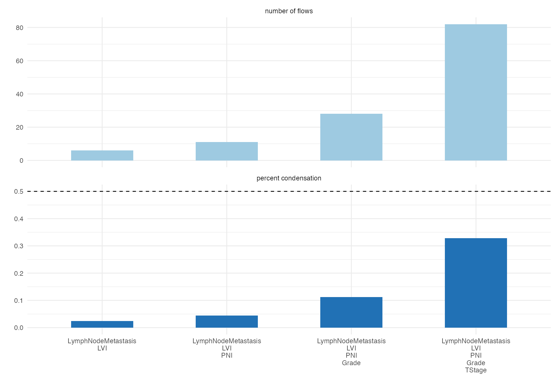
Complex Pathological Progression
# Detailed pathological progression analysis
alluvial(
  data = viz_data,
  vars = c("Grade", "TStage", "LVI", "PNI"),
  condensationvar = "LymphNodeMetastasis"
)
#>
#>  ALLUVIAL DIAGRAMS
#>
#> character(0)
#> [1] "Number of flows: 47"
#> [1] "Original Dataframe reduced to 18.8 %"
#> [1] "Maximum weight of a single flow 5.6 %"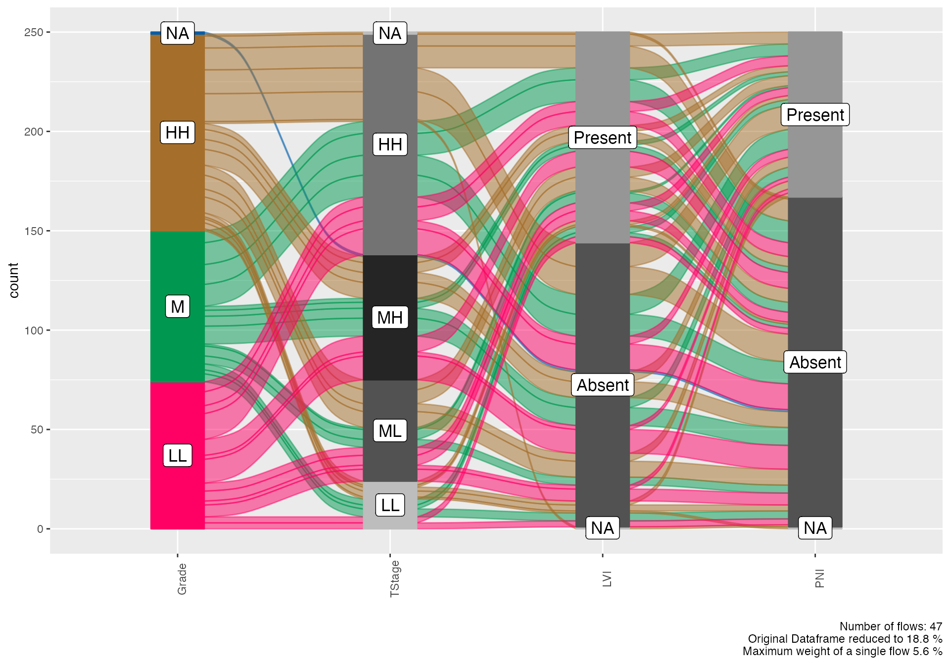
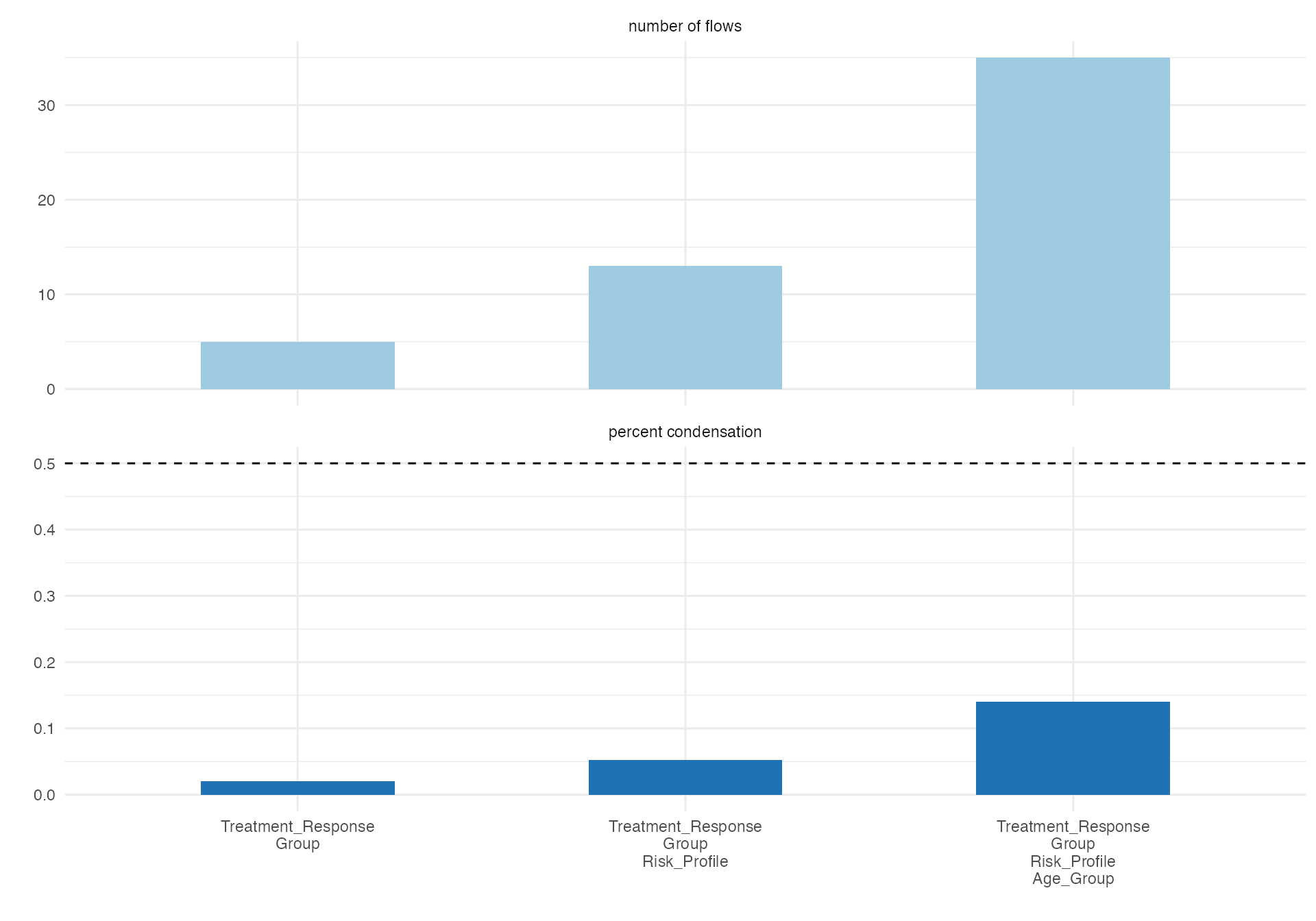
Treatment Response Flow
# Treatment response pathway
alluvial(
  data = viz_data,
  vars = c("Age_Group", "Risk_Profile", "Group"),
  condensationvar = "Treatment_Response"
)
#>
#>  ALLUVIAL DIAGRAMS
#>
#> character(0)
#> [1] "Number of flows: 20"
#> [1] "Original Dataframe reduced to 8 %"
#> [1] "Maximum weight of a single flow 12 %"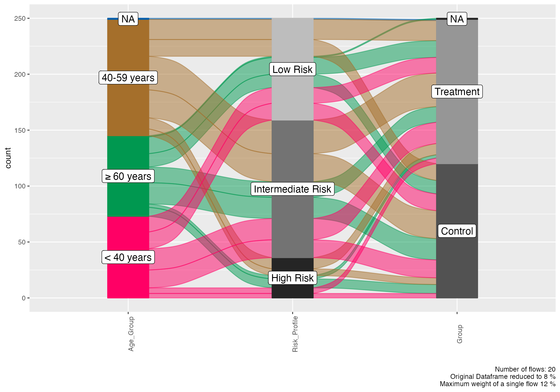
Section 3: Set Relationship Visualizations
Venn Diagrams - Biomarker Overlap
# Prepare binary indicators for Venn analysis
venn_data <- viz_data %>%
mutate(
LVI_Present = ifelse(LVI == "Present", 1, 0),
PNI_Present = ifelse(PNI == "Present", 1, 0),
LN_Positive = ifelse(LymphNodeMetastasis == "Present", 1, 0),
High_Grade = ifelse(Grade == "3", 1, 0)
)
# Three-way Venn diagram of invasion markers
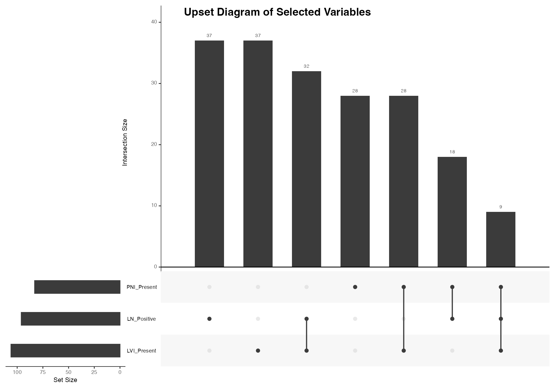
venn(
data = venn_data,
var1 = "LVI_Present",
var1true = 1,
var2 = "PNI_Present",
var2true = 1,
var3 = "LN_Positive",
var3true = 1,
var4 = NULL,
var4true = NULL
)
#>
#> VENN DIAGRAM
#>
#> character(0)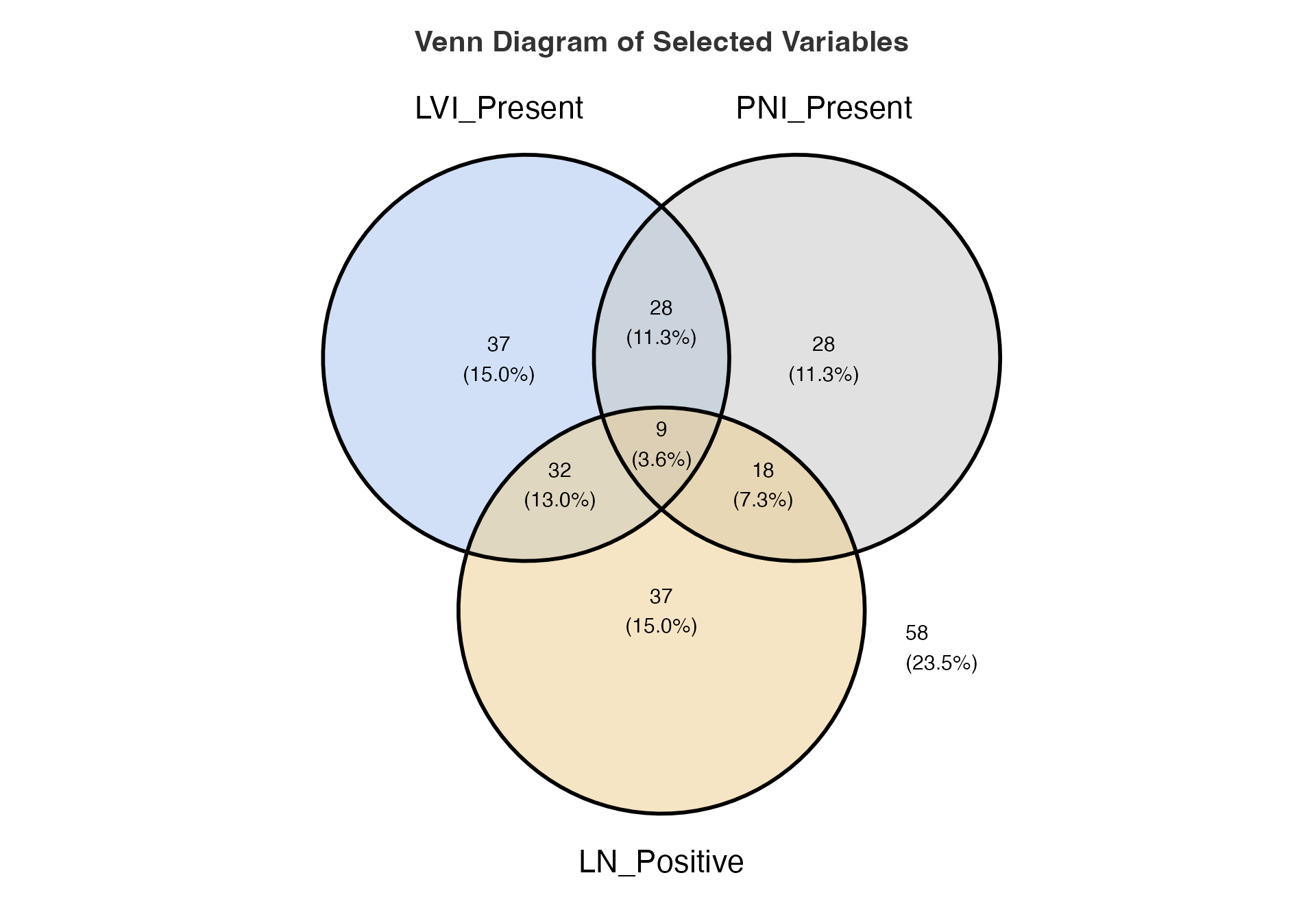
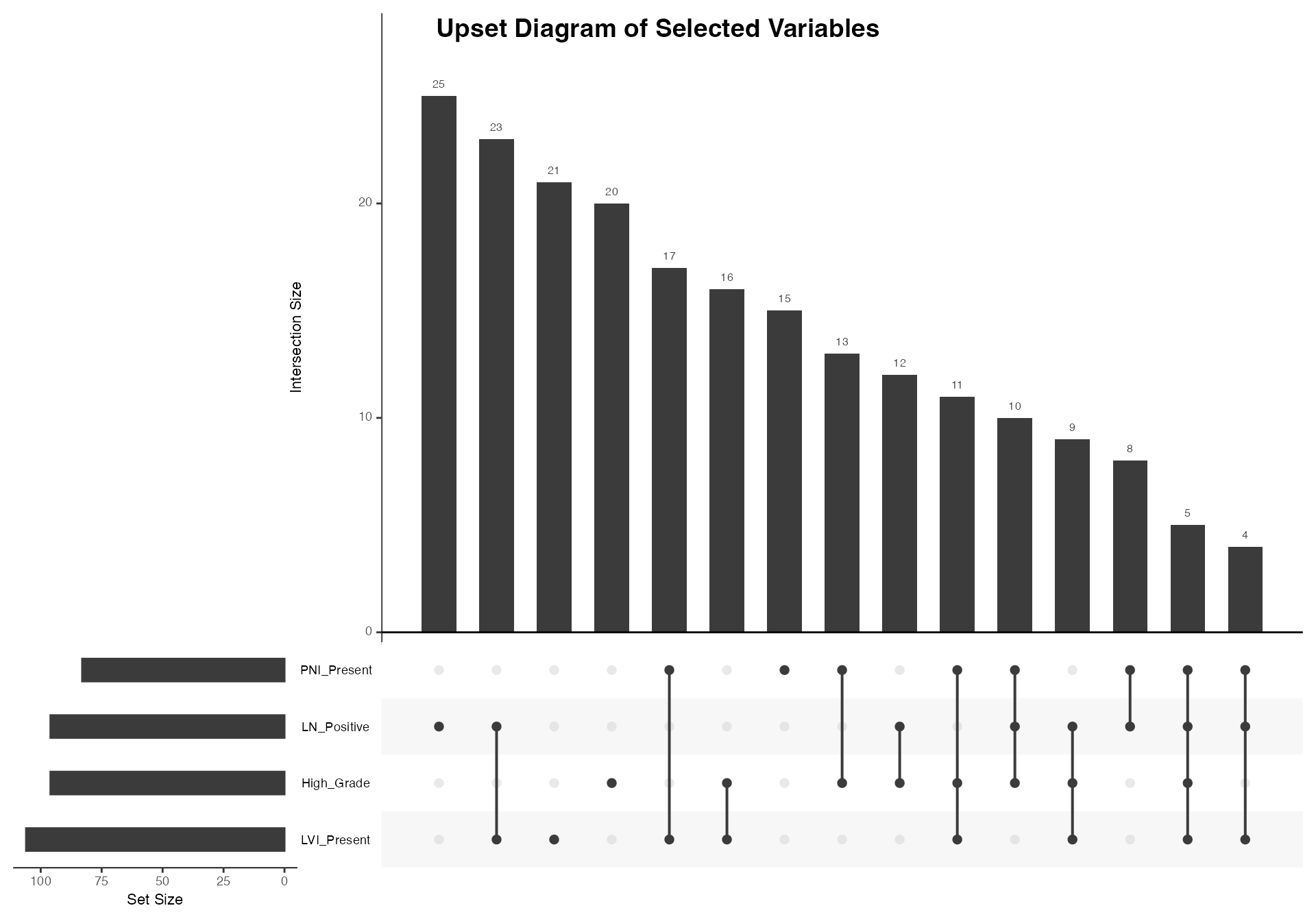
Four-way Set Analysis
# Four-way analysis including grade
venn(
  data = venn_data,
  var1 = "LVI_Present",
  var1true = 1,
  var2 = "PNI_Present",
  var2true = 1,
  var3 = "LN_Positive",
  var3true = 1,
  var4 = "High_Grade",
  var4true = 1
)
#>
#>  VENN DIAGRAM
#>
#> character(0)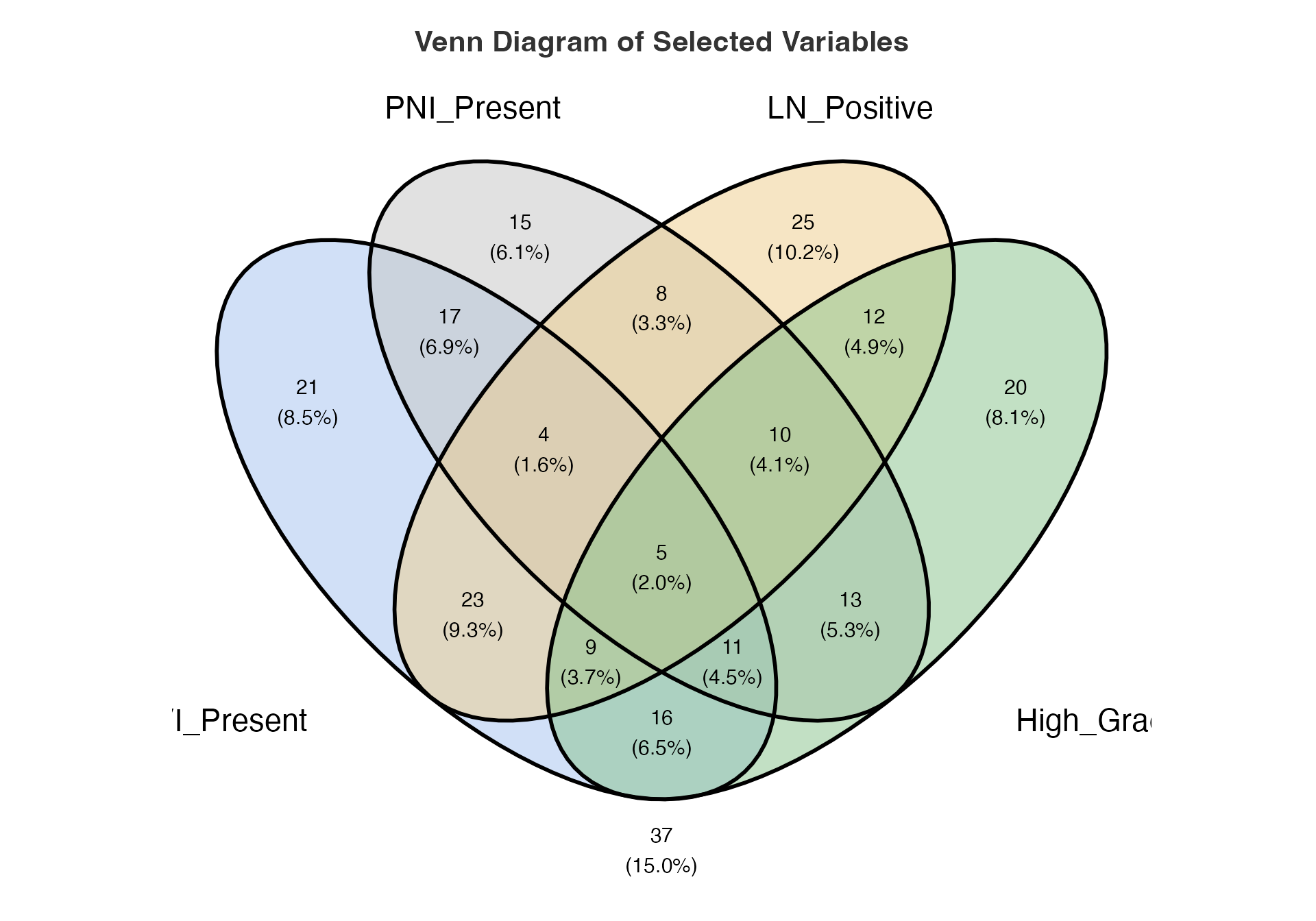
Section 4: Hierarchical Data Visualization
Variable Tree - Data Structure Overview
# Comprehensive variable tree
tryCatch({
  vartree(
    data = viz_data,
    vars = c("Group", "Age_Group", "Sex"),
    percvar = NULL,
    percvarLevel = NULL,
    summaryvar = NULL,
    prunebelow = NULL,
    pruneLevel1 = NULL,
    pruneLevel2 = NULL,
    follow = NULL,
    followLevel1 = NULL,
    followLevel2 = NULL,
    excl = FALSE,
    vp = TRUE,
    horizontal = FALSE,
    sline = TRUE,
    varnames = FALSE,
    nodelabel = TRUE,
    pct = FALSE
  )
}, error = function(e) {
  cat("Variable tree visualization temporarily unavailable due to rendering issues.\n")
  cat("Error:", e$message, "\n")
})
#> Variable tree visualization temporarily unavailable due to rendering issues.
#> Error: $ operator is invalid for atomic vectors
Outcome-focused Tree
# Tree focused on outcome predictors
tryCatch({
  vartree(
    data = viz_data,
    vars = c("Treatment_Response", "Risk_Profile", "Age_Group"),
    percvar = NULL,
    percvarLevel = NULL,
    summaryvar = NULL,
    prunebelow = NULL,
    pruneLevel1 = NULL,
    pruneLevel2 = NULL,
    follow = NULL,
    followLevel1 = NULL,
    followLevel2 = NULL,
    excl = FALSE,
    vp = TRUE,
    horizontal = FALSE,
    sline = TRUE,
    varnames = FALSE,
    nodelabel = TRUE,
    pct = FALSE
  )
}, error = function(e) {
  cat("Variable tree visualization temporarily unavailable due to rendering issues.\n")
  cat("Error:", e$message, "\n")
})
#> Variable tree visualization temporarily unavailable due to rendering issues.
#> Error: $ operator is invalid for atomic vectors
Section 5: Treatment Response Visualizations
Waterfall Plot - Individual Response
# Prepare response data with enhanced categorization
response_enhanced <- treatmentResponse %>%
  mutate(
    RECIST_Response = case_when(
      is.na(ResponseValue) ~ "Not Evaluable",
      ResponseValue <= -30 ~ "Partial Response",
      ResponseValue > -30 & ResponseValue < 20 ~ "Stable Disease",
      ResponseValue >= 20 ~ "Progressive Disease"
    ),
    Response_Magnitude = case_when(
      ResponseValue <= -50 ~ "Major Response",
      ResponseValue <= -30 ~ "Partial Response",
      ResponseValue > -30 & ResponseValue < 20 ~ "Stable Disease",
      ResponseValue >= 20 & ResponseValue < 50 ~ "Progression",
      ResponseValue >= 50 ~ "Rapid Progression",
      TRUE ~ "Not Evaluable"
    ),
    # Add time variable for waterfall analysis (weeks from baseline)
    Time = row_number() * 2
  ) %>%
  arrange(ResponseValue)

# Standard waterfall plot
waterfall(
  data = response_enhanced,
  patientID = "PatientID",
  responseVar = "ResponseValue",
  timeVar = "Time"
)
#>
#>  TREATMENT RESPONSE ANALYSIS
#>
#>  Response Categories Based on RECIST v1.1 Criteria
#>  ─────────────────────────────────────────────────
#>    Category    Number of Patients    Percentage
#>  ─────────────────────────────────────────────────
#>  ─────────────────────────────────────────────────
#>
#>
#>  Person-Time Analysis
#>  ──────────────────────────────────────────────────────────────────────────────────────────────────────────────────────
#>    Response Category    Patients    % Patients    Person-Time    % Time    Median Time to Response    Median Duration
#>  ──────────────────────────────────────────────────────────────────────────────────────────────────────────────────────
#>  ──────────────────────────────────────────────────────────────────────────────────────────────────────────────────────
#>
#>
#>  Clinical Response Metrics
#>  ─────────────────────────
#>    Metric    Value
#>  ─────────────────────────
#>  ─────────────────────────
Waterfall with Response Categories
# Waterfall colored by response category
waterfall(
  data = response_enhanced,
  patientID = "PatientID",
  responseVar = "ResponseValue",
  timeVar = "Time"
)
#>
#>  TREATMENT RESPONSE ANALYSIS
#>
#>  Response Categories Based on RECIST v1.1 Criteria
#>  ─────────────────────────────────────────────────
#>    Category    Number of Patients    Percentage
#>  ─────────────────────────────────────────────────
#>  ─────────────────────────────────────────────────
#>
#>
#>  Person-Time Analysis
#>  ──────────────────────────────────────────────────────────────────────────────────────────────────────────────────────
#>    Response Category    Patients    % Patients    Person-Time    % Time    Median Time to Response    Median Duration
#>  ──────────────────────────────────────────────────────────────────────────────────────────────────────────────────────
#>  ──────────────────────────────────────────────────────────────────────────────────────────────────────────────────────
#>
#>
#>  Clinical Response Metrics
#>  ─────────────────────────
#>    Metric    Value
#>  ─────────────────────────
#>  ─────────────────────────
Section 6: Timeline Visualizations
Swimmer Plot - Patient Timelines
# Prepare swimmer plot data
swimmer_data <- viz_data %>%
  filter(ID <= 30) %>%  # Limit for clarity
  mutate(
    PatientID = paste0("PT", sprintf("%03d", ID)),
    Treatment_Start = 0,  # All patients start at time 0
    Treatment_Duration = pmax(1, OverallTime * runif(n(), 0.5, 1.0)),
    Event_Time = ifelse(Outcome == 1, OverallTime, NA),
    Response_Time = Treatment_Duration * runif(n(), 0.2, 0.6),
    # Convert Outcome to factor for event plotting
    Event_Status = factor(Outcome, levels = c(0, 1), labels = c("No Event", "Event"))
  ) %>%
  arrange(desc(OverallTime))

# Basic swimmer plot
swimmerplot(
  data = swimmer_data,
  patientID = "PatientID",
  start = "Treatment_Start",
  end = "OverallTime",
  event = "Event_Status",
  sortVariable = "OverallTime",
  milestone1Date = NULL,
  milestone2Date = NULL,
  milestone3Date = NULL,
  milestone4Date = NULL,
  milestone5Date = NULL
)
#>
#>  PATIENT TIMELINE ANALYSIS
#>
#> character(0)
#>
#>  Timeline Summary
#>  ───────────────────────────────────────────────────────
#>    Metric                                 Value
#>  ───────────────────────────────────────────────────────
#>    Median Duration                          0.23324573
#>    Mean Duration                            0.23868322
#>    Standard Deviation                       0.08284499
#>    Range                                    0.27595269
#>    Minimum                                  0.10183968
#>    Maximum                                  0.37779238
#>    25th Percentile                          0.18725361
#>    75th Percentile                          0.29894875
#>    Total Person-Time                        6.92181340
#>    Number of Subjects                      30.00000000
#>    Mean Follow-up Time                      0.23868322
#>    No Event Rate                           31.03448276
#>    No Event Incidence (per 100 months)    130.02373042
#>    Event Rate                              68.96551724
#>    Event Incidence (per 100 months)       288.94162316
#>  ───────────────────────────────────────────────────────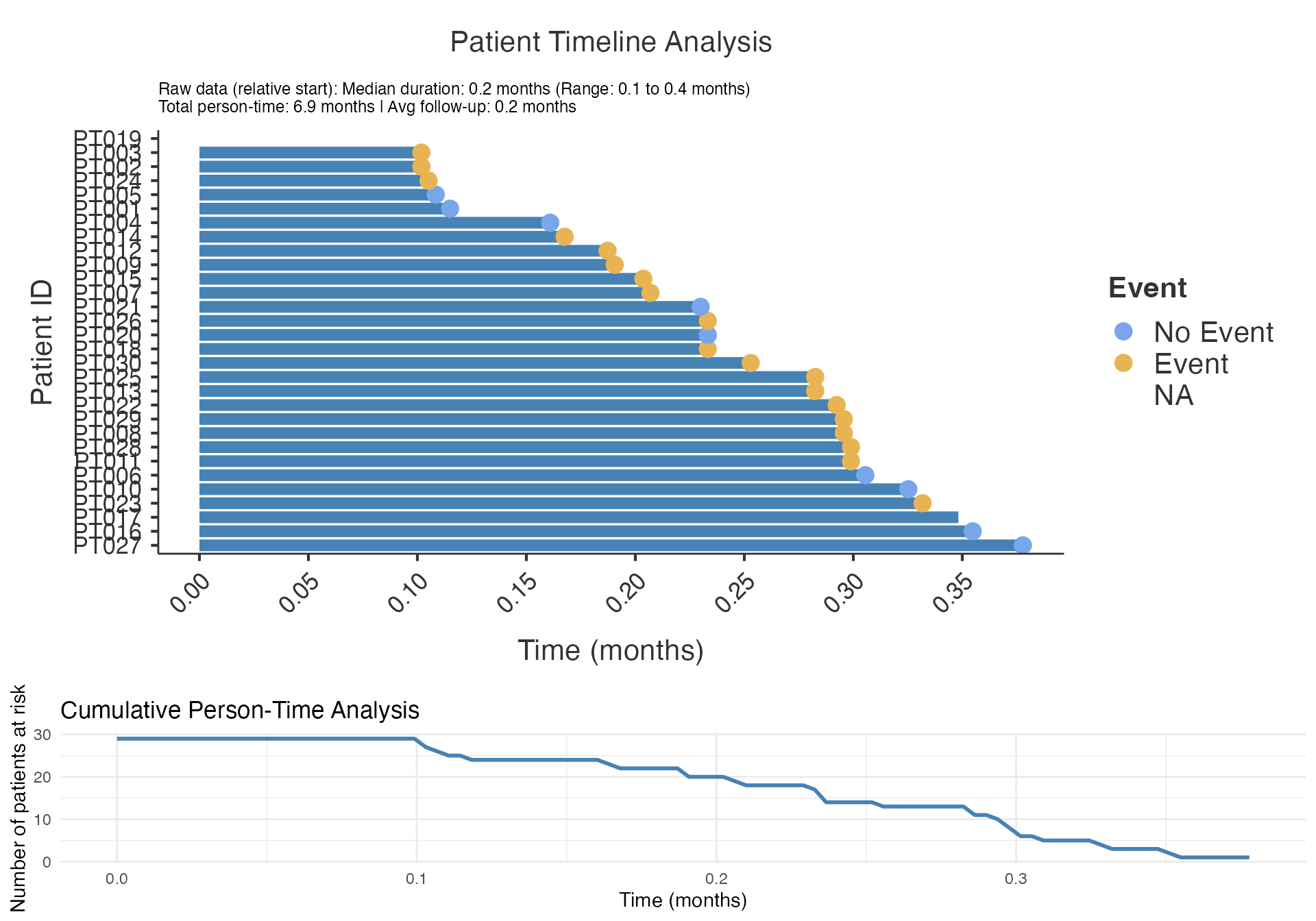
#> TableGrob (2 x 1) "arrange": 2 grobs
#>   z     cells    name           grob
#> 1 1 (1-1,1-1) arrange gtable[layout]
#> 2 2 (2-2,1-1) arrange gtable[layout]
Swimmer Plot by Treatment Group
# Swimmer plot with grouping
swimmerplot(
  data = swimmer_data,
  patientID = "PatientID",
  start = "Treatment_Start",
  end = "OverallTime",
  event = "Event_Status",
  sortVariable = "Group",
  milestone1Date = NULL,
  milestone2Date = NULL,
  milestone3Date = NULL,
  milestone4Date = NULL,
  milestone5Date = NULL
)
#>
#>  PATIENT TIMELINE ANALYSIS
#>
#> character(0)
#>
#>  Timeline Summary
#>  ───────────────────────────────────────────────────────
#>    Metric                                 Value
#>  ───────────────────────────────────────────────────────
#>    Median Duration                          0.23324573
#>    Mean Duration                            0.23868322
#>    Standard Deviation                       0.08284499
#>    Range                                    0.27595269
#>    Minimum                                  0.10183968
#>    Maximum                                  0.37779238
#>    25th Percentile                          0.18725361
#>    75th Percentile                          0.29894875
#>    Total Person-Time                        6.92181340
#>    Number of Subjects                      30.00000000
#>    Mean Follow-up Time                      0.23868322
#>    No Event Rate                           31.03448276
#>    No Event Incidence (per 100 months)    130.02373042
#>    Event Rate                              68.96551724
#>    Event Incidence (per 100 months)       288.94162316
#>  ───────────────────────────────────────────────────────
#> TableGrob (2 x 1) "arrange": 2 grobs
#>   z     cells    name           grob
#> 1 1 (1-1,1-1) arrange gtable[layout]
#> 2 2 (2-2,1-1) arrange gtable[layout]
Section 7: Data Quality Visualizations
Benford’s Law Analysis
# Benford's law for measurement data
benford(
  data = viz_data,
  var = "MeasurementA"
)
#>
#>  BENFORD ANALYSIS
#>
#>  See
#>  <a href = 'https://github.com/carloscinelli/benford.analysis'>Package
#>  documentation for interpratation.
#>
#> Benford object:
#>
#> Data: var
#> Number of observations used = 135
#> Number of obs. for second order = 134
#> First digits analysed = 2
#>
#> Mantissa:
#>
#>    Statistic  Value
#>         Mean  0.506
#>          Var  0.108
#>  Ex.Kurtosis -1.514
#>     Skewness -0.037
#>
#>
#> The 5 largest deviations:
#>
#>   digits absolute.diff
#> 1     52          4.88
#> 2     17          4.65
#> 3     66          4.12
#> 4     13          3.66
#> 5     16          3.55
#>
#> Stats:
#>
#>  Pearson's Chi-squared test
#>
#> data:  var
#> X-squared = 137.97, df = 89, p-value = 0.0006808
#>
#>
#>  Mantissa Arc Test
#>
#> data:  var
#> L2 = 0.058715, df = 2, p-value = 0.000361
#>
#> Mean Absolute Deviation (MAD): 0.008005873
#> MAD Conformity - Nigrini (2012): Nonconformity
#> Distortion Factor: NaN
#>
#> Remember: Real data will never conform perfectly to Benford's Law. You should not focus on p-values!    MeasurementA
#>            <num>
#>  1:    0.0176978
#>  2:    1.7391655
#>  3:    0.5256537
#>  4:    1.7557878
#>  5:    0.5239132
#>  6:    0.1729459
#>  7:    0.1769035
#>  8:    0.5289038
#>  9:    0.5236107
#> 10:    1.7691411
#> 11:    0.5241260
#> 12:    0.5263020
#> 13:    1.7349714
#> 14:    0.1749262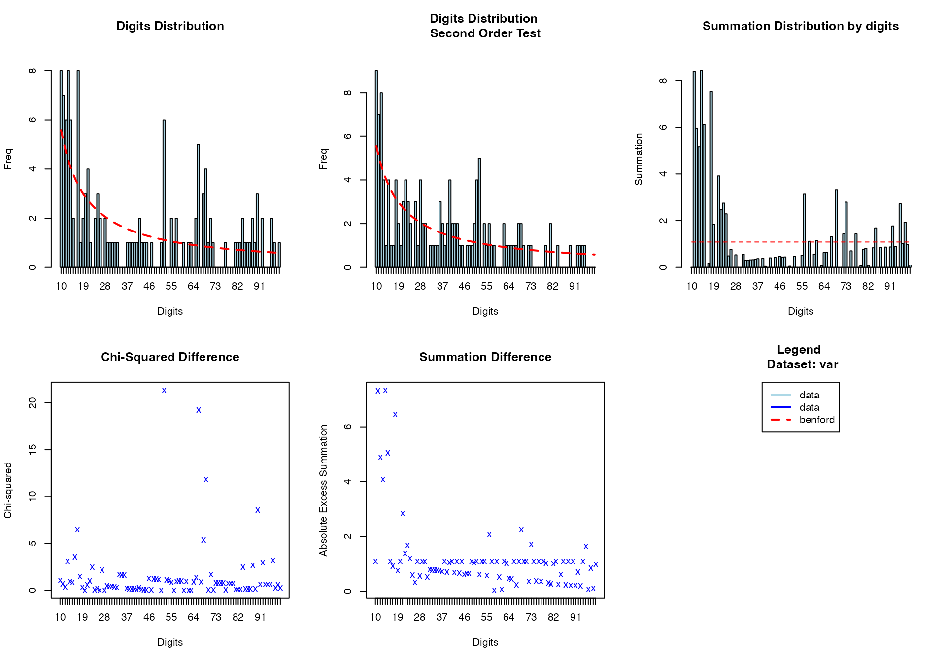
#> $xlog
#> [1] FALSE
#>
#> $ylog
#> [1] FALSE
#>
#> $adj
#> [1] 0.5
#>
#> $ann
#> [1] TRUE
#>
#> $ask
#> [1] FALSE
#>
#> $bg
#> [1] "transparent"
#>
#> $bty
#> [1] "o"
#>
#> $cex
#> [1] 0.66
#>
#> $cex.axis
#> [1] 1
#>
#> $cex.lab
#> [1] 1
#>
#> $cex.main
#> [1] 1.2
#>
#> $cex.sub
#> [1] 1
#>
#> $col
#> [1] "black"
#>
#> $col.axis
#> [1] "black"
#>
#> $col.lab
#> [1] "black"
#>
#> $col.main
#> [1] "black"
#>
#> $col.sub
#> [1] "black"
#>
#> $crt
#> [1] 0
#>
#> $err
#> [1] 0
#>
#> $family
#> [1] ""
#>
#> $fg
#> [1] "black"
#>
#> $fig
#> [1] 0.6666667 1.0000000 0.0000000 0.5000000
#>
#> $fin
#> [1] 10  7
#>
#> $font
#> [1] 1
#>
#> $font.axis
#> [1] 1
#>
#> $font.lab
#> [1] 1
#>
#> $font.main
#> [1] 2
#>
#> $font.sub
#> [1] 1
#>
#> $lab
#> [1] 5 5 7
#>
#> $las
#> [1] 0
#>
#> $lend
#> [1] "round"
#>
#> $lheight
#> [1] 1
#>
#> $ljoin
#> [1] "round"
#>
#> $lmitre
#> [1] 10
#>
#> $lty
#> [1] "solid"
#>
#> $lwd
#> [1] 1
#>
#> $mai
#> [1] 1.02 0.82 0.82 0.42
#>
#> $mar
#> [1] 5.1 4.1 4.1 2.1
#>
#> $mex
#> [1] 1
#>
#> $mfcol
#> [1] 1 1
#>
#> $mfg
#> [1] 1 1 1 1
#>
#> $mfrow
#> [1] 1 1
#>
#> $mgp
#> [1] 3 1 0
#>
#> $mkh
#> [1] 0.001
#>
#> $new
#> [1] TRUE
#>
#> $oma
#> [1] 0 0 0 0
#>
#> $omd
#> [1] 0 1 0 1
#>
#> $omi
#> [1] 0 0 0 0
#>
#> $pch
#> [1] 1
#>
#> $pin
#> [1] 8.76 5.16
#>
#> $plt
#> [1] 0.0620000 0.9380000 0.1314286 0.8685714
#>
#> $ps
#> [1] 12
#>
#> $pty
#> [1] "m"
#>
#> $smo
#> [1] 1
#>
#> $srt
#> [1] 0
#>
#> $tck
#> [1] NA
#>
#> $tcl
#> [1] -0.5
#>
#> $usr
#> [1] 0.568 1.432 0.568 1.432
#>
#> $xaxp
#> [1] 0 1 5
#>
#> $xaxs
#> [1] "r"
#>
#> $xaxt
#> [1] "s"
#>
#> $xpd
#> [1] FALSE
#>
#> $yaxp
#> [1] 0 1 5
#>
#> $yaxs
#> [1] "r"
#>
#> $yaxt
#> [1] "s"
#>
#> $ylbias
#> [1] 0.2
Multi-variable Benford Analysis
# Benford's law for follow-up time
benford(
  data = viz_data,
  var = "OverallTime"
)
#>
#>  BENFORD ANALYSIS
#>
#>  See
#>  <a href = 'https://github.com/carloscinelli/benford.analysis'>Package
#>  documentation for interpratation.
#>
#> Benford object:
#>
#> Data: var
#> Number of observations used = 248
#> Number of obs. for second order = 157
#> First digits analysed = 2
#>
#> Mantissa:
#>
#>    Statistic  Value
#>         Mean  0.569
#>          Var  0.091
#>  Ex.Kurtosis -1.023
#>     Skewness -0.389
#>
#>
#> The 5 largest deviations:
#>
#>   digits absolute.diff
#> 1     12          7.62
#> 2     13          6.98
#> 3     32          6.69
#> 4     16          6.53
#> 5     11          5.63
#>
#> Stats:
#>
#>  Pearson's Chi-squared test
#>
#> data:  var
#> X-squared = 149.57, df = 89, p-value = 6.194e-05
#>
#>
#>  Mantissa Arc Test
#>
#> data:  var
#> L2 = 0.033636, df = 2, p-value = 0.0002383
#>
#> Mean Absolute Deviation (MAD): 0.006604894
#> MAD Conformity - Nigrini (2012): Nonconformity
#> Distortion Factor: -34.7503
#>
#> Remember: Real data will never conform perfectly to Benford's Law. You should not focus on p-values!   OverallTime
#>          <num>
#> 1:        13.4
#> 2:        12.9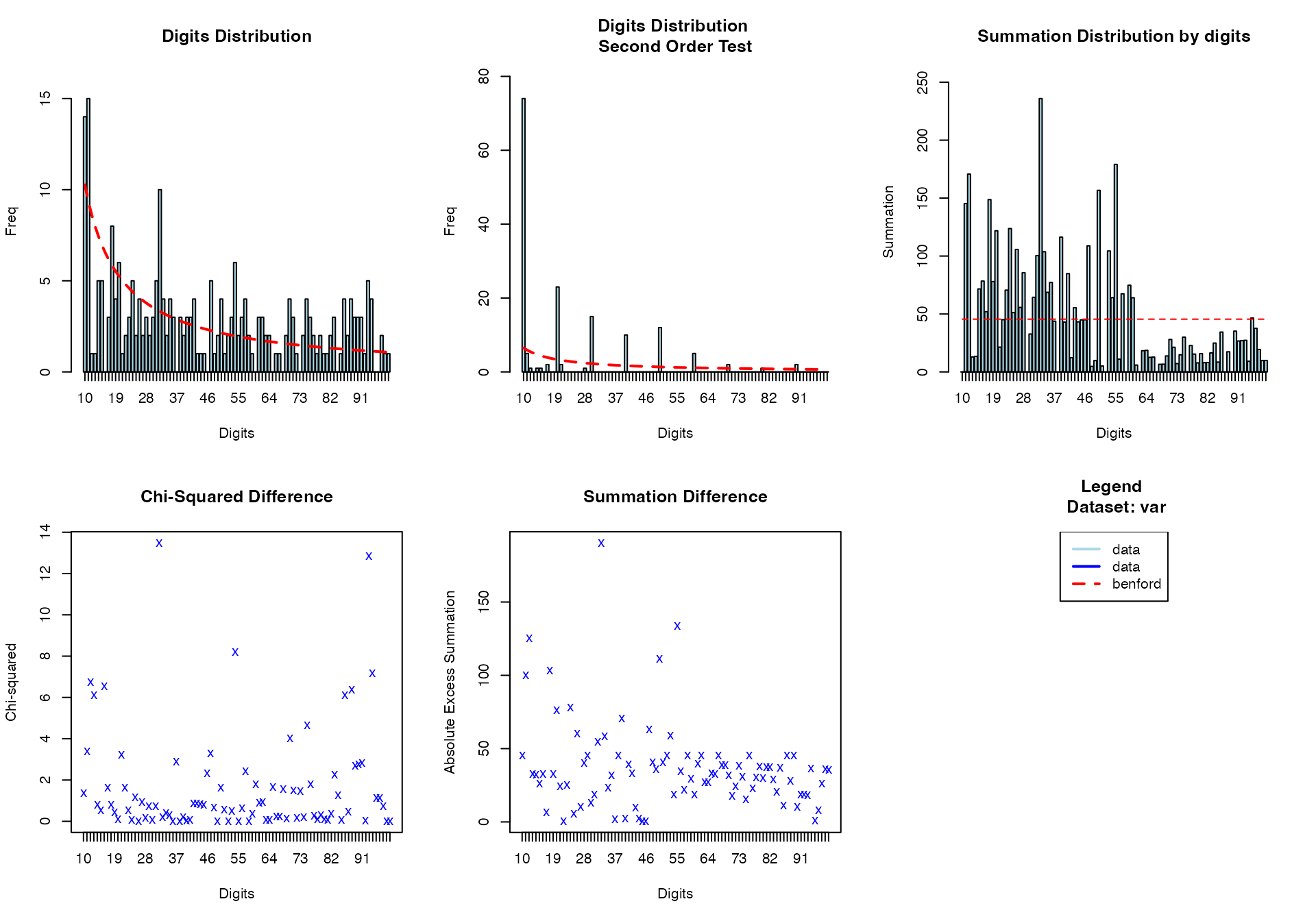
#> $xlog
#> [1] FALSE
#>
#> $ylog
#> [1] FALSE
#>
#> $adj
#> [1] 0.5
#>
#> $ann
#> [1] TRUE
#>
#> $ask
#> [1] FALSE
#>
#> $bg
#> [1] "transparent"
#>
#> $bty
#> [1] "o"
#>
#> $cex
#> [1] 0.66
#>
#> $cex.axis
#> [1] 1
#>
#> $cex.lab
#> [1] 1
#>
#> $cex.main
#> [1] 1.2
#>
#> $cex.sub
#> [1] 1
#>
#> $col
#> [1] "black"
#>
#> $col.axis
#> [1] "black"
#>
#> $col.lab
#> [1] "black"
#>
#> $col.main
#> [1] "black"
#>
#> $col.sub
#> [1] "black"
#>
#> $crt
#> [1] 0
#>
#> $err
#> [1] 0
#>
#> $family
#> [1] ""
#>
#> $fg
#> [1] "black"
#>
#> $fig
#> [1] 0.6666667 1.0000000 0.0000000 0.5000000
#>
#> $fin
#> [1] 10  7
#>
#> $font
#> [1] 1
#>
#> $font.axis
#> [1] 1
#>
#> $font.lab
#> [1] 1
#>
#> $font.main
#> [1] 2
#>
#> $font.sub
#> [1] 1
#>
#> $lab
#> [1] 5 5 7
#>
#> $las
#> [1] 0
#>
#> $lend
#> [1] "round"
#>
#> $lheight
#> [1] 1
#>
#> $ljoin
#> [1] "round"
#>
#> $lmitre
#> [1] 10
#>
#> $lty
#> [1] "solid"
#>
#> $lwd
#> [1] 1
#>
#> $mai
#> [1] 1.02 0.82 0.82 0.42
#>
#> $mar
#> [1] 5.1 4.1 4.1 2.1
#>
#> $mex
#> [1] 1
#>
#> $mfcol
#> [1] 1 1
#>
#> $mfg
#> [1] 1 1 1 1
#>
#> $mfrow
#> [1] 1 1
#>
#> $mgp
#> [1] 3 1 0
#>
#> $mkh
#> [1] 0.001
#>
#> $new
#> [1] TRUE
#>
#> $oma
#> [1] 0 0 0 0
#>
#> $omd
#> [1] 0 1 0 1
#>
#> $omi
#> [1] 0 0 0 0
#>
#> $pch
#> [1] 1
#>
#> $pin
#> [1] 8.76 5.16
#>
#> $plt
#> [1] 0.0620000 0.9380000 0.1314286 0.8685714
#>
#> $ps
#> [1] 12
#>
#> $pty
#> [1] "m"
#>
#> $smo
#> [1] 1
#>
#> $srt
#> [1] 0
#>
#> $tck
#> [1] NA
#>
#> $tcl
#> [1] -0.5
#>
#> $usr
#> [1] 0.568 1.432 0.568 1.432
#>
#> $xaxp
#> [1] 0 1 5
#>
#> $xaxs
#> [1] "r"
#>
#> $xaxt
#> [1] "s"
#>
#> $xpd
#> [1] FALSE
#>
#> $yaxp
#> [1] 0 1 5
#>
#> $yaxs
#> [1] "r"
#>
#> $yaxt
#> [1] "s"
#>
#> $ylbias
#> [1] 0.2
Section 8: Advanced Composite Visualizations
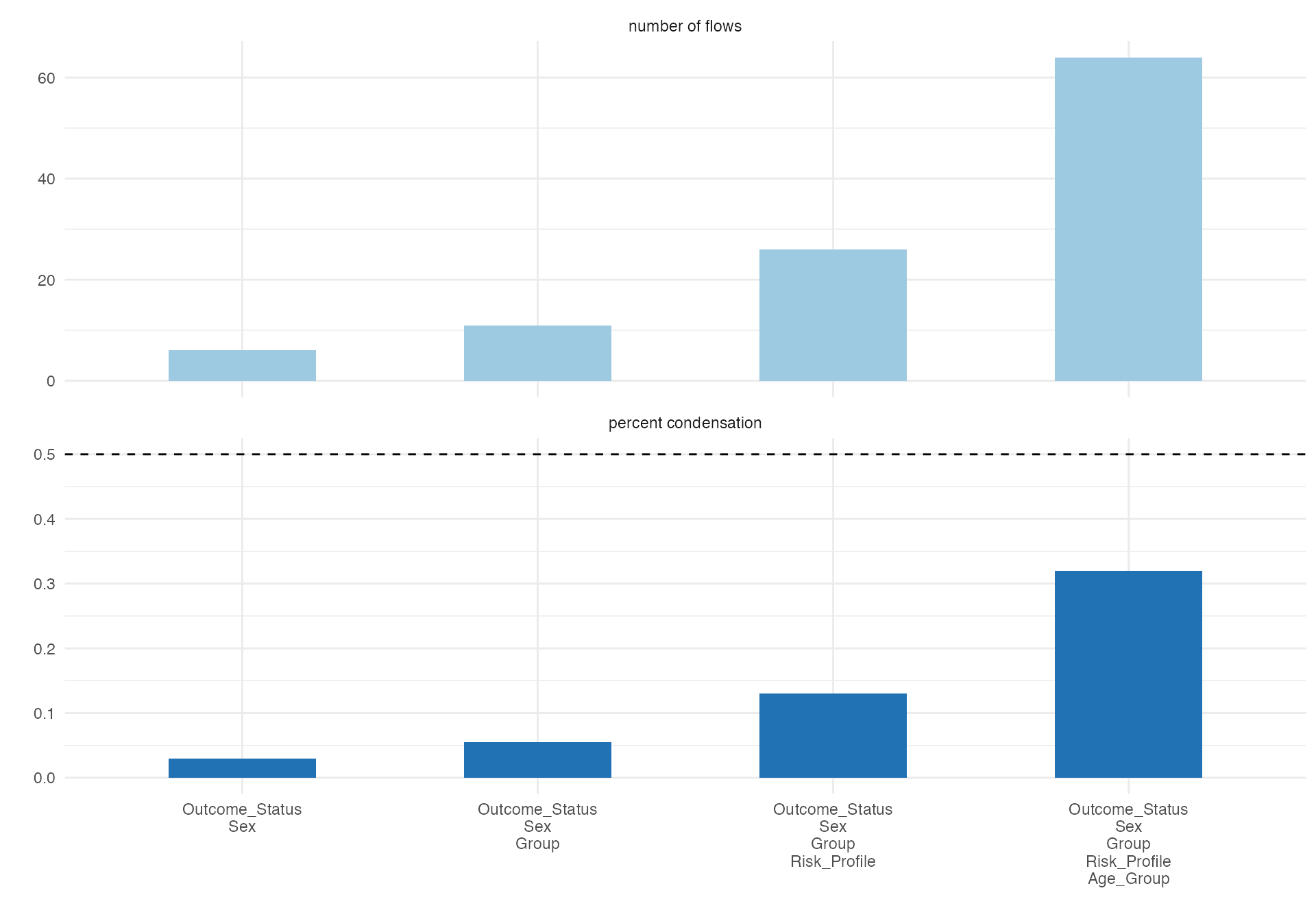
Multi-dimensional Analysis
# Complex alluvial showing multiple relationships
alluvial(
  data = viz_data %>% sample_n(200),
  vars = c("Age_Group", "Sex", "Risk_Profile", "Group", "Outcome_Status"),
  condensationvar = "Outcome_Status"
)
#>
#>  ALLUVIAL DIAGRAMS
#>
#> character(0)
#> [1] "Number of flows: 64"
#> [1] "Original Dataframe reduced to 32 %"
#> [1] "Maximum weight of a single flow 4.5 %"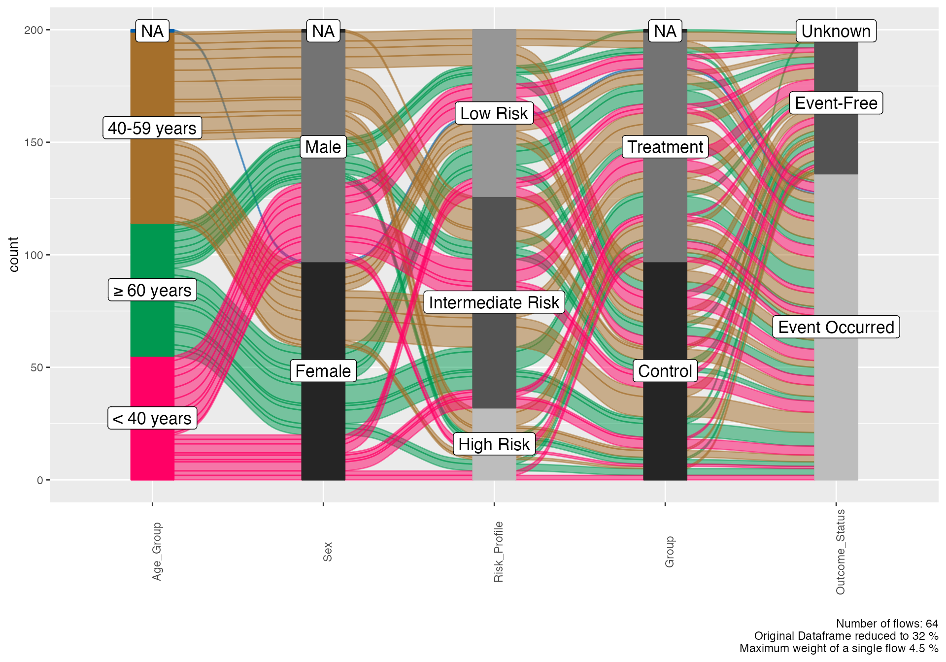
Biomarker Integration Visualization
# Create biomarker categories for visualization
biomarker_viz <- viz_data %>%
mutate(
Measurement_Profile = case_when(
MeasurementA > median(MeasurementA, na.rm = TRUE) &
MeasurementB > median(MeasurementB, na.rm = TRUE) ~ "High-High",
MeasurementA > median(MeasurementA, na.rm = TRUE) &
MeasurementB <= median(MeasurementB, na.rm = TRUE) ~ "High-Low",
MeasurementA <= median(MeasurementA, na.rm = TRUE) &
MeasurementB > median(MeasurementB, na.rm = TRUE) ~ "Low-High",
TRUE ~ "Low-Low"
)
)
# Biomarker-outcome relationship
alluvial(
data = biomarker_viz,
vars = c("Measurement_Profile", "Risk_Profile", "Treatment_Response"),
condensationvar = "Treatment_Response"
)
#>
#> ALLUVIAL DIAGRAMS
#>
#> character(0)
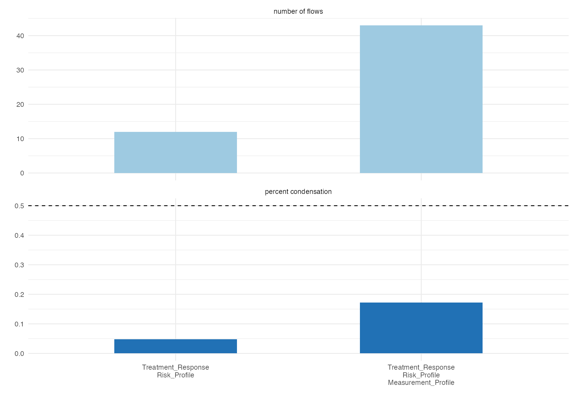
#> [1] "Number of flows: 43"
#> [1] "Original Dataframe reduced to 17.2 %"
#> [1] "Maximum weight of a single flow 5.6 %"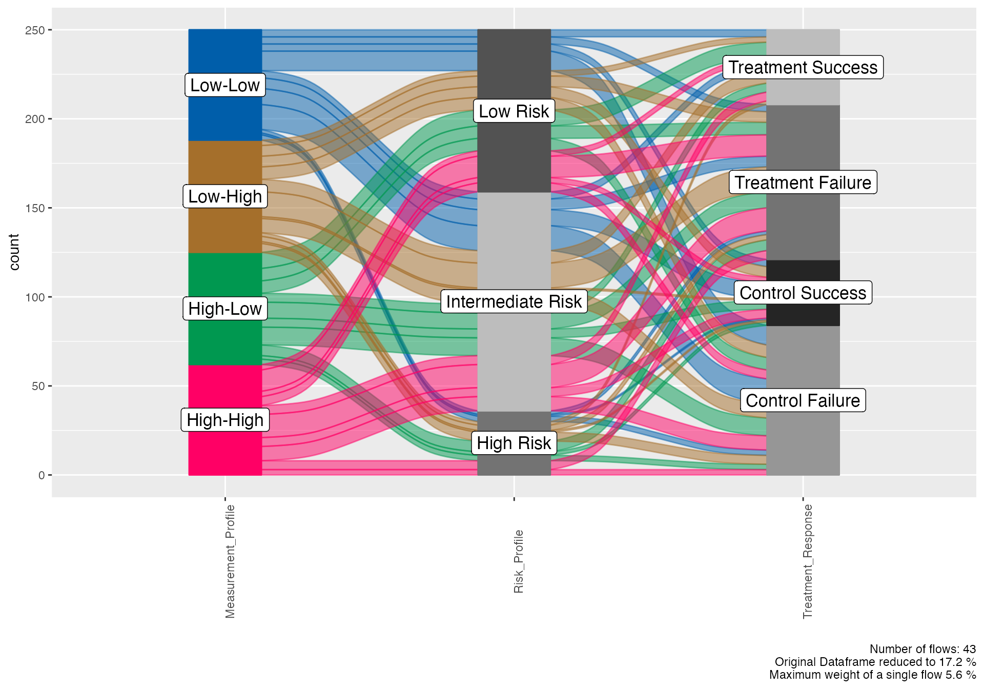
Section 9: Publication-Ready Customization
Color Scheme Guidelines
# Demonstrate color considerations for publications
cat("Recommended color schemes for clinical research:\n\n")
#> Recommended color schemes for clinical research:
cat("• Treatment groups: Blue (#2E86AB) vs Orange (#F24236)\n")
#> • Treatment groups: Blue (#2E86AB) vs Orange (#F24236)
cat("• Risk levels: Green (#00CC66) → Yellow (#FFCC00) → Red (#FF3300)\n")
#> • Risk levels: Green (#00CC66) → Yellow (#FFCC00) → Red (#FF3300)
cat("• Outcomes: Success (#4CAF50) vs Failure (#F44336)\n")
#> • Outcomes: Success (#4CAF50) vs Failure (#F44336)
cat("• Demographics: Standard accessible palette\n")
#> • Demographics: Standard accessible palette
cat("• Pathology: Sequential color scales for severity\n\n")
#> • Pathology: Sequential color scales for severity
cat("All visualizations should be colorblind-friendly and print well in grayscale.\n")
#> All visualizations should be colorblind-friendly and print well in grayscale.
Figure Legend Best Practices
# Example of comprehensive figure annotation
example_figure_legend <- "
Figure 1. Treatment Response Analysis in Cancer Patients (N=250)

Panel A: Waterfall plot showing individual patient responses to treatment,
measured as percentage change in tumor size from baseline. Each bar represents
one patient, ordered by response magnitude. Horizontal lines indicate RECIST
criteria thresholds: -30% (partial response) and +20% (progressive disease).

Panel B: Alluvial diagram depicting patient flow from baseline characteristics
through treatment assignment to clinical outcomes. Line thickness represents
number of patients; connections show relationship patterns between variables.

Abbreviations: PR, partial response; SD, stable disease; PD, progressive disease;
RECIST, Response Evaluation Criteria in Solid Tumors.
"

cat(example_figure_legend)
#>
#> Figure 1. Treatment Response Analysis in Cancer Patients (N=250)
#>
#> Panel A: Waterfall plot showing individual patient responses to treatment,
#> measured as percentage change in tumor size from baseline. Each bar represents
#> one patient, ordered by response magnitude. Horizontal lines indicate RECIST
#> criteria thresholds: -30% (partial response) and +20% (progressive disease).
#>
#> Panel B: Alluvial diagram depicting patient flow from baseline characteristics
#> through treatment assignment to clinical outcomes. Line thickness represents
#> number of patients; connections show relationship patterns between variables.
#>
#> Abbreviations: PR, partial response; SD, stable disease; PD, progressive disease;
#> RECIST, Response Evaluation Criteria in Solid Tumors.
Section 10: Workflow Integration
Complete Analysis Pipeline Visualization
# Demonstrate integrated workflow visualization
workflow_demo <- viz_data %>%
filter(!is.na(Risk_Profile) & !is.na(Treatment_Response))
# Patient journey from enrollment to outcome
alluvial(
data = workflow_demo,
vars = c("Sex", "Age_Group", "Risk_Profile", "Group", "Treatment_Response"),
condensationvar = "Treatment_Response"
)
#>
#> ALLUVIAL DIAGRAMS
#>
#> character(0)
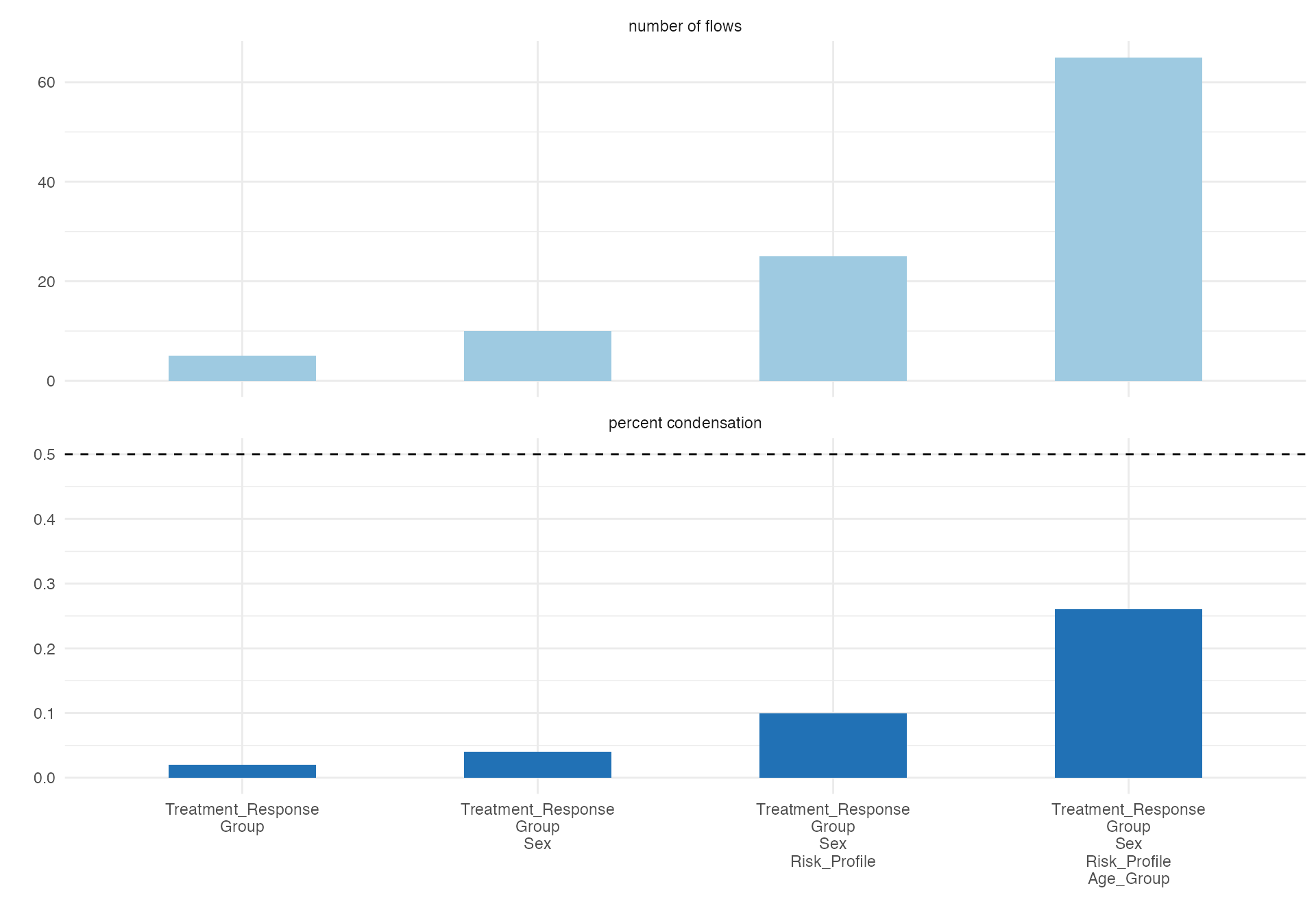
#> [1] "Number of flows: 65"
#> [1] "Original Dataframe reduced to 26 %"
#> [1] "Maximum weight of a single flow 4.4 %"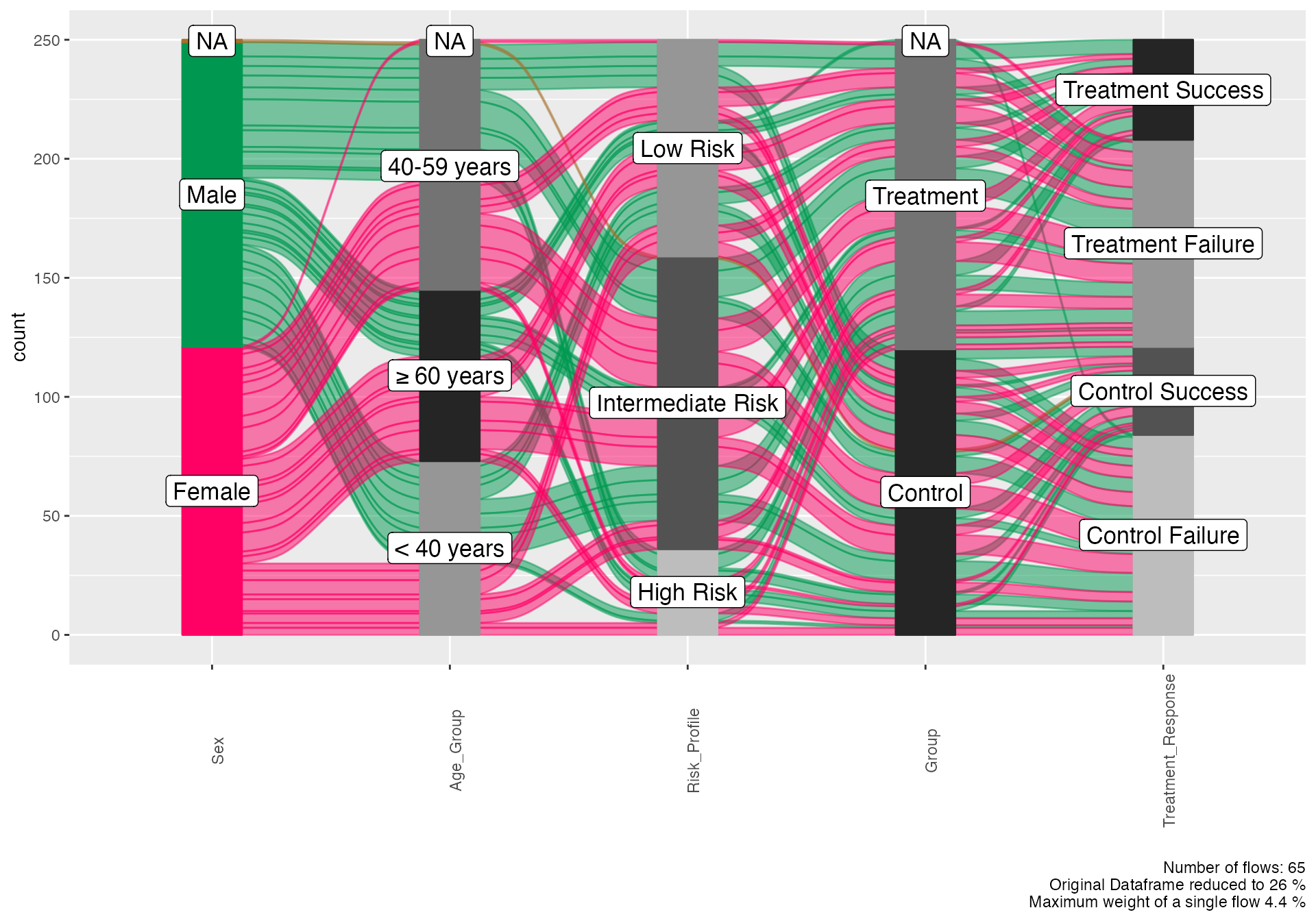
Multi-panel Figure Concept
cat("Multi-panel figure recommendations for manuscripts:\n\n")
#> Multi-panel figure recommendations for manuscripts:
cat("Panel A: Demographics (Age pyramid by treatment group)\n")
#> Panel A: Demographics (Age pyramid by treatment group)
cat("Panel B: Baseline characteristics (Alluvial: risk → treatment assignment)\n")
#> Panel B: Baseline characteristics (Alluvial: risk → treatment assignment)
cat("Panel C: Treatment response (Waterfall plot with RECIST categories)\n")
#> Panel C: Treatment response (Waterfall plot with RECIST categories)
cat("Panel D: Outcome relationships (Venn diagram of risk factors)\n")
#> Panel D: Outcome relationships (Venn diagram of risk factors)
cat("Panel E: Timeline analysis (Swimmer plot by response group)\n\n")
#> Panel E: Timeline analysis (Swimmer plot by response group)
cat("This approach provides comprehensive visual narrative of study results.\n")
#> This approach provides comprehensive visual narrative of study results.
Implementation in jamovi
All visualizations are available through jamovi’s interface:
Navigation Path
-
Demographics:
Exploration > ClinicoPath Descriptive Plots > Age Pyramid -
Relationships:
Exploration > ClinicoPath Descriptive Plots > Alluvial Diagrams -
Set Analysis:
Exploration > ClinicoPath Descriptive Plots > Venn Diagram -
Data Structure:
Exploration > ClinicoPath Descriptive Plots > Variable Tree -
Treatment Response:
Exploration > Patient Follow-Up Plots > Treatment Response Analysis -
Timelines:
Exploration > Patient Follow-Up Plots > Swimmer Plot -
Quality Assessment:
Exploration > ClinicoPath Descriptives > Benford Analysis
jamovi Advantages for Visualization
- Interactive Parameter Adjustment: Real-time preview of visualization changes
- Export Options: Multiple formats for manuscripts and presentations
- No Programming Required: Point-and-click creation of complex visualizations
- Consistent Styling: Automatic application of publication-ready themes
- Reproducible Output: Saved analyses for consistent figure generation
Best Practices Summary
Design Guidelines
- Choose appropriate visualization types for your data structure
- Maintain consistent color schemes across related figures
- Include comprehensive legends and annotations
- Optimize for your target audience (clinical vs. research)
- Test readability in grayscale and for colorblind viewers
Technical Considerations
- Resolution: Use vector formats (SVG, PDF) for scalable figures
- Size: Plan for journal column widths and presentation screens
- Accessibility: Ensure compliance with accessibility standards
- File Formats: Match journal requirements for submission
Clinical Research Specific
- Patient Privacy: Never include identifiable information in visualizations
- Statistical Accuracy: Ensure visualizations accurately represent data
- Regulatory Compliance: Follow guidelines for clinical trial reporting
- Peer Review: Design with peer review process in mind
This visualization gallery demonstrates the full range of clinical research visualization capabilities available in ClinicoPathDescriptives, providing templates and examples for creating impactful, publication-ready figures that effectively communicate research findings.